In Part 3 of this series: The adventures continued with a detailed analysis of the fields Birth Date, Telephone Number and E-mail Address. This provided you with an opportunity to become familiar with analysis techniques that use a combination of field values and field formats.
You also saw examples of how valid values in a valid format can have an invalid context, how valid field formats can conceal invalid field values, and how free-form fields are often easier to analyze as formats constructed by parsing and classifying the individual values within the field.
In Part 4, you will continue your adventures in data profiling by going postal...postal address that is, by first analyzing the following fields: City Name, State Abbreviation, Zip Code and Country Code.
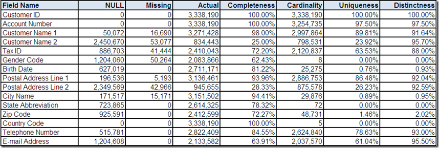
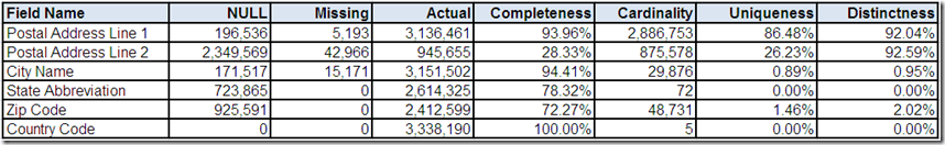
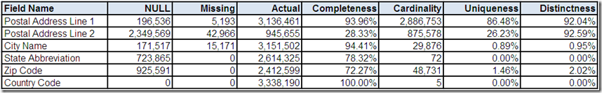
Previously, the data profiling tool provided you with the following statistical summaries for postal address:
Country Code
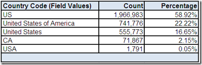
In Part 1, we wondered if 5 distinct Country Code field values indicated international postal addresses. This drill-down “screen” provided by the data profiling tool shows the frequency distribution. First of all, the field name might have lead us to assume we would only see ISO 3166 standard country codes.
However, two of the field values are a country name and not a country code. This is another example of how verifying data matches the metadata that describes it is one essential analytical task that data profiling can help us with, providing a much needed reality check for the perceptions and assumptions that we may have about our data.
Secondly, the field values would appear to indicate that most of the postal addresses are from the United States. However, if you recall from Part 3, we discovered some potential clues during our analysis of Telephone Number, which included two formats that appear invalid based on North American standards, and E-mail Address, which included country code Top Level Domain (TLD) values for Canada and the United Kingdom.
Additionally, whenever a field is both 100% complete and has an extremely low cardinality, it could be an indication that the most frequently occurring value is the field's default value.
Therefore, is it possible that US is simply the default value for Country Code for this data source?
Zip Code
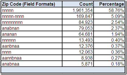
From the Part 1 comments, it was noted that Zip Code as a field name is unique to the postal code system used in the United States (US). This drill-down “screen” provided by the data profiling tool shows the field has only a total of ten field formats.
The only valid field formats for ZIP (which, by the way, is an acronym for Zone Improvement Plan) are 5 digits and 9 digits when the 4 digit ZIP+4 add-on code is also present, which according to the US postal standards should be separated from the 5 digit ZIP Code using a hyphen.
The actual field formats in the Zip Code field of this data source reveal another example of how we should not make assumptions about our data based on the metadata that describes it. Although the three most frequently occurring field formats appear to be representative of potentially valid US postal codes, the alphanumeric postal code field formats are our first indication that it is, perhaps sadly, not all about US (pun intended, my fellow Americans).
The two most frequently occurring alphanumeric field formats appear to be representative of potentially valid Canadian postal codes. An interesting thing to note is that their combined frequency distribution is double the count of the number of records having CA as a Country Code field value. Therefore, if these field formats are representative of a valid Canadian postal code, then some Canadian records have a contextually invalid field value in Country Code.
The other alphanumeric field formats appear to be representative of potentially valid postal codes for the United Kingdom (UK). To the uninitiated, the postal codes of Canada (CA) and the UK appear very similar. Both postal code formats contain two parts, which according to their postal standards should be separated by a single character space.
In CA postal codes, the first part is called the Forward Sortation Area (FSA) and the second part is called the Local Delivery Unit (LDU). In UK postal codes, the first part is called the outward code and the second part is called the inward code.
One easy way to spot the difference is that a UK inward code always has the format of a digit followed by two letters (i.e. “naa” in the field formats generated by my fictional data profiling tool), whereas a CA LDU always has the format of a digit followed by a letter followed by another digit (i.e. “nan”).
However, we should never rule out the possibility of transposed values making a CA postal code look like a UK postal code, or vice versa. Also, never forget the common data quality challenge of valid field formats concealing invalid field values.
Returning to the most frequently occurring field format of 5 digits, can we assume all valid field values would represent US postal addresses? Of course not. One significant reason is that a 5 digit postal code is one of the most common formats in the world.
Just some of the other countries also using a 5 digit postal code include: Algeria, Cuba, Egypt, Finland, France, Germany, Indonesia, Israel, Italy, Kuwait, Mexico, Spain, and Turkey.
What about the less frequently occurring field formats of 4 digits and 6 digits? It is certainly possible that these field formats could indicate erroneous attempts at entering a valid US postal code. However, it could also indicate the presence of additional non-US postal addresses.
Just some of the countries using a 4 digit postal code include: Australia, Austria, Belgium, Denmark, El Salvador, Georgia (no, the US state did not once again secede, there is also a country called Georgia and its not even in the Americas), Hungary, Luxembourg, Norway, and Venezuela. Just some of the countries using a 6 digit postal code include: Belarus, China, India, Kazakhstan (yes, Borat fans, Kazakhstan is a real country), Russia, and Singapore.
Additionally, why do almost 28% of the records in this data source not have a field value for Zip Code?
One of the possibilities is that we could have postal addresses from countries that do not have a postal code system. Just a few examples would be: Aruba, Bahamas (sorry fellow fans of the Beach Boys, but both Jamaica and Bermuda have a postal code system, and therefore I could not take you down to Kokomo), Fiji (home of my favorite bottled water), and Ireland (home of my ancestors and inventors of my second favorite coffee).
State Abbreviation
From the Part 1 comments, it was noted that the cardinality of State Abbreviation appeared suspect because, if we assume that its content matches its metadata, then we would expect only 51 distinct values (i.e. actual US state abbreviations without counting US territories) and not the 72 distinct values discovered by the data profiling tool.
Let's assume that drill-downs have revealed the single profiled field data type was CHAR, and the profiled minimum/maximum field lengths were both 2. Therefore, State Abbreviation, when populated, always contains a two character field value.
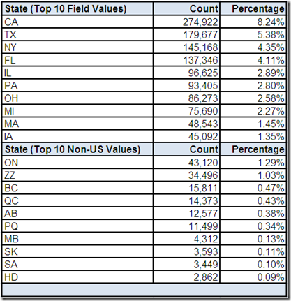
This drill-down “screen” first displays the top ten most frequently occurring values in the State Abbreviation field, which are all valid US state abbreviations. The frequency distributions are also within general expectations since eight of the largest US states by population are represented.
However, our previous analysis of Country Code and Zip Code has already made us aware that international postal addresses exist in this data source. Therefore, this drill-down “screen” also displays the top ten most frequently occurring non-US values based on the data profiling tool comparing all 72 distinct values against a list of valid US state and territory abbreviations.
Most of the field values discovered by this analysis appear to be valid CA province codes (including PQ being used as a common alternative for QC – the province of Quebec or Québec si vous préférez). These frequency distributions are also within general expectations since six of the largest CA provinces by population are represented. Their combined frequency distribution is also fairly close to the combined frequency distribution of potentially valid Canadian postal codes found in the Zip Code field.
However, we still have three additional values (ZZ, SA, HD) which require more analysis. Additionally, almost 22% of the records in this data source do not have a field value for State Abbreviation, which could be attributable to the fact that even when the postal standards for other countries include something analogous to a US state or CA province, it might not be compatible with a two character field length.
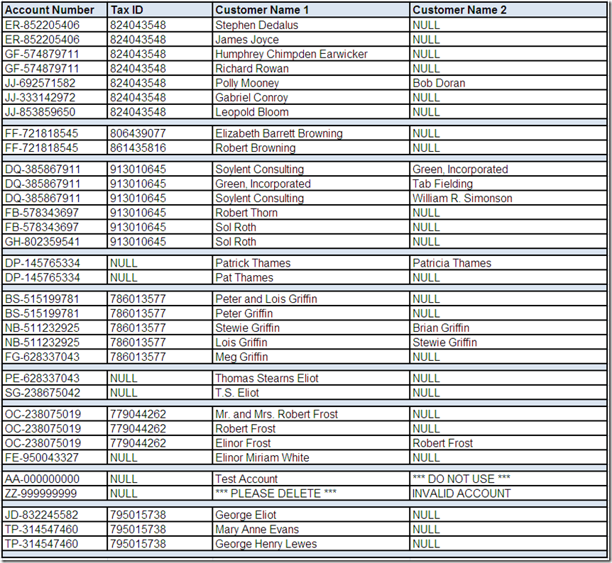
City Name
Let's assume that we have performed some preliminary analysis on the statistical summaries and frequency distributions provided by the data profiling tool for the City Name field using the techniques illustrated throughout this series so far.
Let's also assume analyzing the City Name field in isolation didn't reveal anything suspicious. The field is consistently populated and its frequently occurring values appeared to meet general expectations. Therefore, let's assume we have performed additional drill-down analysis using the data profiling tool and have selected the following records of interest:
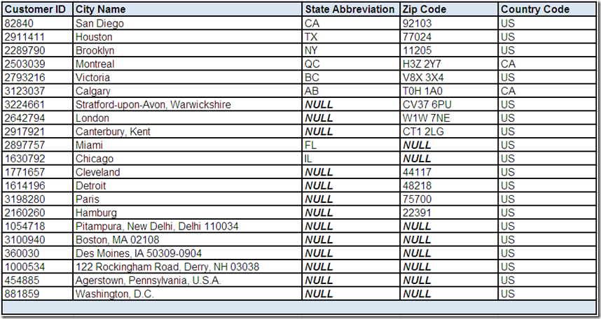
Based on reviewing these records, what conclusions, assumptions, and questions do you have about the City Name field?
What other questions can you think of for these fields? What other analysis do you think should be performed for these fields?
In Part 5 of this series: We will continue the adventures in data profiling by completing our initial analysis of postal address by investigating the following fields: Postal Address Line 1 and Postal Address Line 2.
Related Posts
Adventures in Data Profiling (Part 1)
Adventures in Data Profiling (Part 2)
Adventures in Data Profiling (Part 3)
Adventures in Data Profiling (Part 5)
Adventures in Data Profiling (Part 6)
Adventures in Data Profiling (Part 7)
Getting Your Data Freq On
International Man of Postal Address Standards
Since I am a geographically-challenged American, the first (and often the only necessary) option I choose for assistance with international postal address standards is Graham Rhind.
His excellent book The Global Source-Book for Address Data Management is an invaluable resource and recognized standard reference that contains over 1,000 pages of data pertaining to over 240 countries and territories.