DQ-Tip: “Data quality tools do not solve data quality problems...”

Data Quality (DQ) Tips is an OCDQ regular segment.  Each DQ-Tip is a clear and concise data quality pearl of wisdom.

“Data quality tools do not solve data quality problems—People solve data quality problems.”

This DQ-Tip came from the DataFlux IDEAS 2010 Assessing Data Quality Maturity workshop conducted by David Loshin, whose new book The Practitioner's Guide to Data Quality Improvement will be released next month.

Just like all technology, data quality tools are enablers.  Data quality tools provide people with the capability for solving data quality problems, for which there are no fast and easy solutions.  Although incredible advancements in technology continue, there are no Magic Beans for data quality.

And there never will be.

An organization’s data quality initiative can only be successful when people take on the challenge united by collaboration, guided by an effective methodology, and of course, enabled by powerful technology.

By far the most important variable in implementing successful and sustainable data quality improvements is acknowledging David’s sage advice:  people—not tools—solve data quality problems.


Related Posts

DQ-Tip: “There is no such thing as data accuracy...”

DQ-Tip: “Data quality is primarily about context not accuracy...”

DQ-Tip: “There is no point in monitoring data quality...”

DQ-Tip: “Don't pass bad data on to the next person...”

DQ-Tip: “...Go talk with the people using the data”

DQ-Tip: “Data quality is about more than just improving your data...”

DQ-Tip: “Start where you are...”

Delivering Data Happiness

Recently, a happiness meme has been making its way around the data quality blogosphere.

Its origins have been traced to a lovely day in Denmark when Henrik Liliendahl Sørensen, with help from The Muppet Show, asked “Why do you watch it?” referring to the typically negative spin in the data quality blogosphere, where it seems we are:

“Always describing how bad data is everywhere.

Bashing executives who don’t get it.

Telling about all the hard obstacles ahead. Explaining you don’t have to boil the ocean but might get success by settling for warming up a nice little drop of water.

Despite really wanting to tell a lot of success stories, being the funny Fozzie Bear on the stage, well, I am afraid I also have been spending most of my time on the balcony with Statler and Waldorf.

So, from this day forward: More success stories.”

In his recent blog posts, The Ugly Duckling and Data Quality Tools: The Cygnets in Information Quality, Henrik has been sharing more success stories, or to phrase it in an even happier way: delivering data happiness.


Delivering Data Happiness

I am reading the great book Delivering Happiness: A Path to Profits, Passion, and Purpose by Tony Hsieh, the CEO of Zappos.

Obviously, the book’s title inspired the title of this blog post. 

One of the Zappos core values is “build a positive team and family spirit,” and I have been thinking about how that applies to data quality improvements, which are often pursued as one of the many aspects of a data governance program.

Most data governance maturity models describe an organization’s evolution through a series of stages intended to measure its capability and maturity, tendency toward being reactive or proactive, and inclination to be project-oriented or program-oriented.

Most data governance programs are started by organizations that are confronted with a painfully obvious need for improvement.

The primary reason that the change management efforts of data governance are resisted is because they rely almost exclusively on negative methods—they emphasize broken business and technical processes, as well as bad data-related employee behaviors.

Although these problems exist and are the root cause of some of the organization’s failures, there are also unheralded processes and employees that prevented other problems from happening, which are the root cause of some of the organization’s successes.

“The best team members,” writes Hsieh while explaining the Zappos core values, “take initiative when they notice issues so that the team and the company can succeed.” 

“The best team members take ownership of issues and collaborate with other team members whenever challenges arise.” 

“The best team members have a positive influence on one another and everyone they encounter.  They strive to eliminate any kind of cynicism and negative interactions.”

The change management efforts of data governance and other enterprise information initiatives often make it sound like no such employees (i.e., “best team members”) currently exist anywhere within an organization. 

The blogosphere, as well as critically acclaimed books and expert presentations at major industry conferences, often seem to be in unanimous and unambiguous agreement in the message that they are broadcasting:

“Everything your organization is currently doing regarding data management is totally wrong!”

Sadly, that isn’t much of an exaggeration.  But I am not trying to accuse anyone of using Machiavellian sales tactics to sell solutions to non-existent problems—poor data quality and data governance maturity are costly realities for many organizations.

Nor am I trying to oversimplify the many real complexities involved when implementing enterprise information initiatives.

However, most of these initiatives focus exclusively on developing new solutions and best practices, failing to even acknowledge the possible presence of existing solutions and best practices.

The success of all enterprise information initiatives requires the kind of enterprise-wide collaboration that is facilitated by the “best team members.”  But where, exactly, do the best team members come from?  Should it really be surprising whenever an enterprise information initiative can’t find any using exclusively negative methods, focusing only on what is currently wrong?

As Gordon Hamilton commented on my previous post, we need to be “helping people rise to the level of the positive expectations, rather than our being codependent in their sinking to the level of the negative expectations.”

We really need to start using more positive methods for fostering change.

Let’s begin by first acknowledging the best team members who are currently delivering data happiness to our organizations.


Related Posts

Why isn’t our data quality worse?

The Road of Collaboration

Common Change

Finding Data Quality

Declaration of Data Governance

The Balancing Act of Awareness

Podcast: Business Technology and Human-Speak

“I can make glass tubes”

Why isn’t our data quality worse?

In psychology, the term negativity bias is used to explain how bad evokes a stronger reaction than good in the human mind.  Don’t believe that theory?  Compare receiving an insult with receiving a compliment—which one do you remember more often?

Now, this doesn’t mean the dark side of the Force is stronger, it simply means that we all have a natural tendency to focus more on the negative aspects, rather than on the positive aspects, of most situations, including data quality.

In the aftermath of poor data quality negatively impacting decision-critical enterprise information, the natural tendency is for a data quality initiative to begin by focusing on the now painfully obvious need for improvement, essentially asking the question:

Why isn’t our data quality better?

Although this type of question is a common reaction to failure, it is also indicative of the problem-seeking mindset caused by our negativity bias.  However, Chip and Dan Heath, authors of the great book Switch, explain that even in failure, there are flashes of success, and following these “bright spots” can illuminate a road map for action, encouraging a solution-seeking mindset.

“To pursue bright spots is to ask the question:

What’s working, and how can we do more of it?

Sounds simple, doesn’t it? 

Yet, in the real-world, this obvious question is almost never asked.

Instead, the question we ask is more problem focused:

What’s broken, and how do we fix it?”


Why isn’t our data quality worse?

For example, let’s pretend that a data quality assessment is performed on a data source used to make critical business decisions.  With the help of business analysts and subject matter experts, it’s verified that this critical source has an 80% data accuracy rate.

The common approach is to ask the following questions (using a problem-seeking mindset):

  • Why isn’t our data quality better?
  • What is the root cause of the 20% inaccurate data?
  • What process (business or technical, or both) is broken, and how do we fix it?
  • What people are responsible, and how do we correct their bad behavior?

But why don’t we ask the following questions (using a solution-seeking mindset):

  • Why isn’t our data quality worse?
  • What is the root cause of the 80% accurate data?
  • What process (business or technical, or both) is working, and how do we re-use it?
  • What people are responsible, and how do we encourage their good behavior?

I am not suggesting that we abandon the first set of questions, especially since there are times when a problem-seeking mindset might be a better approach (after all, it does also incorporate a solution-seeking mindset—albeit after a problem is identified).

I am simply wondering why we often never even consider asking the second set of questions?

Most data quality initiatives focus on developing new solutions—and not re-using existing solutions.

Most data quality initiatives focus on creating new best practices—and not leveraging existing best practices.

Perhaps you can be the chosen one who will bring balance to the data quality initiative by asking both questions:

Why isn’t our data quality better?  Why isn’t our data quality worse?

The Data-Decision Symphony

As I have explained in previous blog posts, I am almost as obsessive-compulsive about literature and philosophy as I am about data and data quality, because I believe that there is much that the arts and the sciences can learn from each other.

Therefore, I really enjoyed recently reading the book Proust Was a Neuroscientist by Jonah Lehrer, which shows that science is not the only path to knowledge.  In fact, when it comes to understanding the brain, art got there first.

Without doubt, I will eventually write several blog posts that use references from this book to help me explain some of my perspectives about data quality and its many related disciplines.

In this blog post, with help from Jonah Lehrer and the composer Igor Stravinsky, I will explain The Data-Decision Symphony.


Data, data everywhere

Data is now everywhere.  Data is no longer just in the structured rows of our relational databases and spreadsheets.  Data is also in the unstructured streams of our Facebook and Twitter status updates, as well as our blog posts, our photos, and our videos.

The challenge is can we somehow manage to listen for business insights among the endless cacophony of chaotic data volumes, and use those insights to enable better business decisions and deliver optimal business performance.

Whether you choose to measure it in terabytes, petabytes, or how much reality bites, the data deluge has commenced—and you had better bring your A-Game to D-Town.  In other words, you need to find innovative ways to derive business insight from your constantly increasing data volumes by overcoming the signal-to-noise ratio encountered during your data analysis.


The Music of the Data

This complex challenge of filtering out the noise of the data until you can detect the music of the data, which is just another way of saying the data that you need to make a critical business decision, is very similar to how we actually experience music.

As Jonah Lehrer explains, “music is nothing but a sliver of sound that we have learned how to hear.  Our sense of sound is a work in progress.  Neurons in the auditory cortex are constantly being altered by the songs and symphonies we listen to.”

“Instead of representing the full spectrum of sound waves vibrating inside the ear, the auditory cortex focuses on finding the note amid the noise.  We tune out the cacophony we can’t understand.”

“This is why we can recognize a single musical pitch played by different instruments.  Although a trumpet and violin produce very different sound waves, we are designed to ignore these differences.  All we care about is pitch.”

Instead of attempting to analyze all of the available data before making a business decision, we need to focus on finding the right data signals amid the data noise.  We need to tune out the cacophony of all the data we don’t need.

Of course, this is easier in theory than it is in practice.

But this is why we need to always begin our data analysis with the business decision in mind.  Many organizations begin with only the data in mind, which results in performing analysis that provides little, if any, business insight and decision support.

“But a work of music,” Lehrer continues, “is not simply a set of individual notes arranged in time.”

“Music really begins when the separate pitches are melted into a pattern.  This is a consequence of the brain’s own limitations.  Music is the pleasurable overflow of information.  Whenever a noise exceeds our processing abilities . . . [we stop] . . . trying to understand the individual notes and seek instead to understand the relationship between the notes.”

“It is this psychological instinct—this desperate neuronal search for a pattern, any pattern—that is the source of music.”

Although few would describe analyzing large volumes of data as a “pleasurable overflow of information,” it is our search for a pattern, any pattern in the data relevant to the decision, which allows us to discover a potential source of business insight.


The Data-Decision Symphony

“When we listen to a symphony,” explains Lehrer, “we hear a noise in motion, each note blurring into the next.”

“The sound seems continuous.  Of course, the physical reality is that each sound wave is really a separate thing, as discrete as the notes written in the score.  But this isn’t the way we experience the music.”

“We continually abstract on our own inputs, inventing patterns in order to keep pace with the onrush of noise.  And once the brain finds a pattern, it immediately starts to make predictions, imagining what notes will come next.  It projects imaginary order into the future, transposing the melody we have just heard into the melody we expect.  By listening for patterns, by interpreting every note in terms of expectations, we turn the scraps of sound into the ebb and flow of a symphony.”

This is also how we arrive at making a critical business decision based on data analysis. 

We discover a pattern of business context, relevant to the decision, and start making predictions, imagining what will come next, projecting imaginary order into the data stream, turning bits and bytes into the ebb and flow of The Data-Decision Symphony.

However, our search for the consonance of business context among the dissonance of data, could cause us to draw comforting, but false, conclusions—especially if unaware of any confirmation bias—resulting in bad, albeit data-driven, business decisions.

The musicologist Leonard Meyer, in his 1956 book Emotion and Meaning in Music, explained how “music is defined by its flirtation with—but not submission to—expectations of order.  Although music begins with our predilection for patterns, the feeling of music begins when the pattern we imagine starts to break down.”

Lehrer explains how Igor Stravinsky, in The Rite of Spring, “forces us to generate patterns from the music itself, and not from our preconceived notions of what the music should be like.”

Therefore, we must be vigilant when we perform data analysis, making sure to generate patterns from the data itself, and not from our preconceived notions of what the data should be like—especially when we encounter less than perfect data quality.

As Jonah Lehrer explains, “the brain is designed to learn by association: if this, then that.  Music works by subtly toying with our expected associations, enticing us to make predictions and then confronting us with our prediction errors.”

“Music is the sound of art changing the brain.”

The Data-Decision Symphony is the sound of the art and science of data analysis enabling better business decisions.


Related Posts

Data, data everywhere, but where is data quality?

The Real Data Value is Business Insight

The Road of Collaboration

The Idea of Order in Data

Hell is other people’s data

The Circle of Quality


Data Quality Music (DQ-Songs)

A Record Named Duplicate

New Time Human Business

People

You Can’t Always Get the Data You Want

A spoonful of sugar helps the number of data defects go down

Data Quality is such a Rush

I’m Bringing DQ Sexy Back

Imagining the Future of Data Quality

The Very Model of a Modern DQ General

“Some is not a number and soon is not a time”

In a true story that I recently read in the book Switch: How to Change Things When Change Is Hard by Chip and Dan Heath, back in 2004, Donald Berwick, a doctor and the CEO of the Institute for Healthcare Improvement, had some ideas about how to reduce the defect rate in healthcare, which, unlike the vast majority of data defects, was resulting in unnecessary patient deaths.

One common defect was deaths caused by medication mistakes, such as post-surgical patients failing to receive their antibiotics in the specified time, and another common defect was mismanaging patients on ventilators, resulting in death from pneumonia.

Although Berwick initially laid out a great plan for taking action, which proposed very specific process improvements, and was supported by essentially indisputable research, few changes were actually being implemented.  After all, his small, not-for-profit organization had only 75 employees, and had no ability whatsoever to force any changes on the healthcare industry.

So, what did Berwick do?  On December 14, 2004, in a speech that he delivered to a room full of hospital administrators at a major healthcare industry conference, he declared:

“Here is what I think we should do.  I think we should save 100,000 lives.

And I think we should do that by June 14, 2006—18 months from today.

Some is not a number and soon is not a time.

Here’s the number: 100,000.

Here’s the time: June 14, 2006—9 a.m.”

The crowd was astonished.  The goal was daunting.  Of course, all the hospital administrators agreed with the goal to save lives, but for a hospital to reduce its defect rate, it has to first acknowledge having a defect rate.  In other words, it has to admit that some patients are dying needless deaths.  And, of course, the hospital lawyers are not keen to put this admission on the record.


Data Denial

Whenever an organization’s data quality problems are discussed, it is very common to encounter data denial.  Most often, this is a natural self-defense mechanism for the people responsible for business processes, technology, and data—and understandable because of the simple fact that nobody likes to be blamed (or feel blamed) for causing or failing to fix the data quality problems.

But data denial can also doom a data quality improvement initiative from the very beginning.  Of course, everyone will agree that ensuring high quality data is being used to make critical daily business decisions is vitally important to corporate success, but for an organization to reduce its data defects, it has to first acknowledge having data defects.

In other words, the organization has to admit that some business decisions are mistakes being made based on poor quality data.


Half Measures

In his excellent recent blog post Half Measures, Phil Simon discussed the compromises often made during data quality initiatives, half measures such as “cleaning up some of the data, postponing parts of the data cleanup efforts, and taking a wait and see approach as more issues are unearthed.”

Although, as Phil explained, it is understandable that different individuals and factions within large organizations will have vested interests in taking action, just as others are biased towards maintaining the status quo, “don’t wait for the perfect time to cleanse your data—there isn’t any.  Find a good time and do what you can.”


Remarkable Data Quality

As Seth Godin explained in his remarkable book Purple Cow: Transform Your Business by Being Remarkable, the opposite of remarkable is not bad or mediocre or poorly done.  The opposite of remarkable is very good.

In other words, you must first accept that your organization has data defects, but most important, since some is not a number and soon is not a time, you must set specific data quality goals and specific times when you will meet (or exceed) your goals.

So, what happened with Berwick’s goal?  Eighteen months later, at the exact moment he’d promised to return—June 14, 2006, at 9 a.m.—Berwick took the stage again at the same major healthcare industry conference, and announced the results:

“Hospitals enrolled in the 100,000 Lives Campaign have collectively prevented an estimated 122,300 avoidable deaths and, as importantly, have begun to institutionalize new standards of care that will continue to save lives and improve health outcomes into the future.”

Although improving your organization’s data quality—unlike reducing defect rates in healthcare—isn’t a matter of life and death, remarkable data quality is becoming a matter of corporate survival in today’s highly competitive and rapidly evolving world.

Perfect data quality is impossible—but remarkable data quality is not.  Be remarkable.

Worthy Data Quality Whitepapers (Part 3)

In my April 2009 blog post Data Quality Whitepapers are Worthless, I called for data quality whitepapers worth reading.

This post is now the third entry in an ongoing series about data quality whitepapers that I have read and can endorse as worthy.


Matching Technology Improves Data Quality

Steve Sarsfield recently published Matching Technology Improves Data Quality, a worthy data quality whitepaper, which is a primer on the elementary principles, basic theories, and strategies of record matching.

This free whitepaper is available for download from Talend (requires registration by providing your full contact information).

The whitepaper describes the nuances of deterministic and probabilistic matching and the algorithms used to identify the relationships among records.  It covers the processes to employ in conjunction with matching technology to transform raw data into powerful information that drives success in enterprise applications, including customer relationship management (CRM), data warehousing, and master data management (MDM).

Steve Sarsfield is the Talend Data Quality Product Marketing Manager, and author of the book The Data Governance Imperative and the popular blog Data Governance and Data Quality Insider.


Whitepaper Excerpts

Excerpts from Matching Technology Improves Data Quality:

  • “Matching plays an important role in achieving a single view of customers, parts, transactions and almost any type of data.”
  • “Since data doesn’t always tell us the relationship between two data elements, matching technology lets us define rules for items that might be related.”
  • “Nearly all experts agree that standardization is absolutely necessary before matching.  The standardization process improves matching results, even when implemented along with very simple matching algorithms.  However, in combination with advanced matching techniques, standardization can improve information quality even more.”
  • “There are two common types of matching technology on the market today, deterministic and probabilistic.”
  • “Deterministic or rules-based matching is where records are compared using fuzzy algorithms.”
  • “Probabilistic matching is where records are compared using statistical analysis and advanced algorithms.”
  • “Data quality solutions often offer both types of matching, since one is not necessarily superior to the other.”
  • “Organizations often evoke a multi-match strategy, where matching is analyzed from various angles.”
  • “Matching is vital to providing data that is fit-for-use in enterprise applications.”
 

Related Posts

Identifying Duplicate Customers

Customer Incognita

To Parse or Not To Parse

The Very True Fear of False Positives

Data Governance and Data Quality

Worthy Data Quality Whitepapers (Part 2)

Worthy Data Quality Whitepapers (Part 1)

Data Quality Whitepapers are Worthless

Selling the Business Benefits of Data Quality

Mr. ZIP In his book Purple Cow: Transform Your Business by Being Remarkable, Seth Godin used many interesting case studies of effective marketing.  One of them was the United States Postal Services.

“Very few organizations have as timid an audience as the United States Postal Service,” explained Godin.  “Dominated by conservative big customers, the Postal Service has a very hard time innovating.  The big direct marketers are successful because they’ve figured out how to thrive under the current system.  Most individuals are in no hurry to change their mailing habits, either.”

“The majority of new policy initiatives at the Postal Service are either ignored or met with nothing but disdain.  But ZIP+4 was a huge success.  Within a few years, the Postal Service diffused a new idea, causing a change in billions of address records in thousands of databases.  How?”

Doesn’t this daunting challenge sound familiar?  An initiative causing a change in billions of records across multiple databases? 

Sounds an awful lot like a massive data cleansing project, doesn’t it?  If you believe selling the business benefits of data quality, especially on such an epic scale, is easy to do, then stop reading right now—and please publish a blog post about how you did it.


Going Postal on the Business Benefits

Getting back to Godin’s case study, how did the United States Postal Service (USPS) sell the business benefits of ZIP+4?

“First, it was a game-changing innovation,” explains Godin.  “ZIP+4 makes it far easier for marketers to target neighborhoods, and much faster and easier to deliver the mail.  ZIP+4 offered both dramatically increased speed in delivery and a significantly lower cost for bulk mailers.  These benefits made it worth the time it took mailers to pay attention.  The cost of ignoring the innovation would be felt immediately on the bottom line.”

Selling the business benefits of data quality (or anything else for that matter) requires defining its return on investment (ROI), which always comes from tangible business impacts, such as mitigated risks, reduced costs, or increased revenue.

Reducing costs was a major selling point for ZIP+4.  Additionally, it mitigated some of the risks associated with direct marketing campaigns, such as the ability to target neighborhoods more accurately, as well as reduce delays in postal delivery times.

However, perhaps the most significant selling point was that “the cost of ignoring the innovation would be felt immediately on the bottom line.”  In other words, the USPS articulated very well that the cost of doing nothing was very tangible.

The second reason ZIP+4 was a huge success, according to Godin, was that the USPS “wisely singled out a few early adopters.  These were individuals in organizations that were technically savvy and were extremely sensitive to both pricing and speed issues.  These early adopters were also in a position to sneeze the benefits to other, less astute, mailers.”

Sneezing the benefits is a reference to another Seth Godin book, Unleashing the Ideavirus, where he explains how the most effective business ideas are the ones that spread.  Godin uses the term ideavirus to describe an idea that spreads, and the term sneezers to describe the people who spread it.

In my blog post Sneezing Data Quality, I explained that it isn’t easy being sneezy, but true sneezers are the innovators and disruptive agents within an organization.  They can be the catalysts for crucial changes in corporate culture.

However, just like with literal sneezing, it can get really annoying if it occurs too frequently. 

To sell the business benefits, you need sneezers that will do such an exhilarating job championing the cause of data quality, that they will help cause the very idea of a sustained data quality program to go viral throughout your entire organization, thereby unleashing the Data Quality Ideavirus.


Getting Zippy with it

One of the most common objections to data quality initiatives, and especially data cleansing projects, is that they often produce considerable costs without delivering tangible business impacts and significant ROI.

One of the most common ways to attempt selling the business benefits of data quality is the ROI of removing duplicate records, which although sometimes significant (with high duplicate rates) in the sense of reduced costs on the redundant postal deliveries, it doesn’t exactly convince your business stakeholders and financial decision makers of the importance of data quality.

Therefore, it is perhaps somewhat ironic that the USPS story of why ZIP+4 was such a huge success, actually provides such a compelling case study for selling the business benefits of data quality.

However, we should all be inspired by “Zippy” (aka “Mr. Zip” – the USPS Zip Code mascot shown at the beginning of this post), and start “getting zippy with it” (not an official USPS slogan) when it comes to selling the business benefits of data quality:

  1. Define Data Quality ROI using tangible business impacts, such as mitigated risks, reduced costs, or increased revenue
  2. Articulate the cost of doing nothing (i.e., not investing in data quality) by also using tangible business impacts
  3. Select a good early adopter and recruit sneezers to Champion the Data Quality Cause by communicating your successes

What other ideas can you think of for getting zippy with it when it comes to selling the business benefits of data quality?


Related Posts

Promoting Poor Data Quality

Sneezing Data Quality

The Only Thing Necessary for Poor Data Quality

Hyperactive Data Quality (Second Edition)

Data Quality: The Reality Show?

Is your data complete and accurate, but useless to your business?

Ensuring that complete and accurate data is being used to make critical daily business decisions is perhaps the primary reason why data quality is so vitally important to the success of your organization. 

However, this effort can sometimes take on a life of its own, where achieving complete and accurate data is allowed to become the raison d'être of your data management strategy—in other words, you start managing data for the sake of managing data.

When this phantom menace clouds your judgment, your data might be complete and accurate—but useless to your business.

Completeness and Accuracy

How much data is necessary to make an effective business decision?  Having complete (i.e., all available) data seems obviously preferable to incomplete data.  However, with data volumes always burgeoning, the unavoidable fact is that sometimes having more data only adds confusion instead of clarity, thereby becoming a distraction instead of helping you make a better decision.

Returning to my original question, how much data is really necessary to make an effective business decision? 

Accuracy, which, thanks to substantial assistance from my readers, was defined in a previous post as both the correctness of a data value within a limited context such as verification by an authoritative reference (i.e., validity) combined with the correctness of a valid data value within an extensive context including other data as well as business processes (i.e., accuracy). 

Although accurate data is obviously preferable to inaccurate data, less than perfect data quality can not be used as an excuse to delay making a critical business decision.  When it comes to the quality of the data being used to make these business decisions, you can’t always get the data you want, but if you try sometimes, you just might find, you get the business insight you need.

Data-driven Solutions for Business Problems

Obviously, there are even more dimensions of data quality beyond completeness and accuracy. 

However, although it’s about more than just improving your data, data quality can be misperceived to be an activity performed just for the sake of the data.  When, in fact, data quality is an enterprise-wide initiative performed for the sake of implementing data-driven solutions for business problems, enabling better business decisions, and delivering optimal business performance.

In order to accomplish these objectives, data has to be not only complete and accurate, as well as whatever other dimensions you wish to add to your complete and accurate definition of data quality, but most important, data has to be useful to the business.

Perhaps the most common definition for data quality is “fitness for the purpose of use.” 

The missing word, which makes this definition both incomplete and inaccurate, puns intended, is “business.”  In other words, data quality is “fitness for the purpose of business use.”  How complete and how accurate (and however else) the data needs to be is determined by its business use—or uses since, in the vast majority of cases, data has multiple business uses.

Data, data everywhere

With silos replicating data as well as new data being created daily, managing all of the data is not only becoming impractical, but because we are too busy with the activity of trying to manage all of it, no one is stopping to evaluate usage or business relevance.

The fifth of the Five New Ideas From 2010 MIT Information Quality Industry Symposium, which is a recent blog post written by Mark Goloboy, was that “60-90% of operational data is valueless.”

“I won’t say worthless,” Goloboy clarified, “since there is some operational necessity to the transactional systems that created it, but valueless from an analytic perspective.  Data only has value, and is only worth passing through to the Data Warehouse if it can be directly used for analysis and reporting.  No news on that front, but it’s been more of the focus since the proliferation of data has started an increasing trend in storage spend.”

In his recent blog post Are You Afraid to Say Goodbye to Your Data?, Dylan Jones discussed the critical importance of designing an archive strategy for data, as opposed to the default position many organizations take, where burgeoning data volumes are allowed to proliferate because, in large part, no one wants to delete (or, at the very least, archive) any of the existing data. 

This often results in the data that the organization truly needs for continued success getting stuck in the long line of data waiting to be managed, and in many cases, behind data for which the organization no longer has any business use (and perhaps never even had the chance to use when the data was actually needed to make critical business decisions).

“When identifying data in scope for a migration,” Dylan advised, “I typically start from the premise that ALL data is out of scope unless someone can justify its existence.  This forces the emphasis back on the business to justify their use of the data.”

Data Memorioso

Funes el memorioso is a short story by Jorge Luis Borges, which describes a young man named Ireneo Funes who, as a result of a horseback riding accident, has lost his ability to forget.  Although Funes has a tremendous memory, he is so lost in the details of everything he knows that he is unable to convert the information into knowledge and unable, as a result, to grow in wisdom.

In Spanish, the word memorioso means “having a vast memory.”  When Data Memorioso is your data management strategy, your organization becomes so lost in all of the data it manages that it is unable to convert data into business insight and unable, as a result, to survive and thrive in today’s highly competitive and rapidly evolving marketplace.

In their great book Made to Stick: Why Some Ideas Survive and Others Die, Chip Heath and Dan Heath explained that “an accurate but useless idea is still useless.  If a message can’t be used to make predictions or decisions, it is without value, no matter how accurate or comprehensive it is.”  I believe that this is also true for your data and your organization’s business uses for it.

Is your data complete and accurate, but useless to your business?

Common Change

I recently finished reading the great book Switch: How to Change Things When Change Is Hard by Chip Heath and Dan Heath, which examines why it can be so difficult for us to make lasting changes—both professional changes and personal changes.

“For anything to change,” the Heaths explain, “someone has to start acting differently.  Ultimately, all change efforts boil down to the same mission: Can you get people to start behaving in a new way?”

Their metaphor for change of all kinds is making a Switch, which they explain requires the following three things:

  1. Directing the Rider, which is a metaphor for the rational aspect of our decisions and behavior.
  2. Motivating the Elephant, which is a metaphor for the emotional aspect of our decisions and behavior.
  3. Shaping the Path, which is a metaphor for the situational aspect of our decisions and behavior.

Despite being the most common phenomenon in the universe, change is almost universally resisted, making most of us act as if change is anything but common.  Therefore, in this blog post, I will discuss the Heaths three key concepts using some common terminology: Common Sense, Common Feeling, and Common Place—which, when working together, lead to Common Change.


Common Sense

“What looks like resistance is often a lack of clarity,” the Heaths explain.  “Ambiguity is the enemy.  Change begins at the level of individual decisions and behaviors.  To spark movement in a new direction, you need to provide crystal-clear guidance.”

Unfortunately, changes are usually communicated in ways that cause confusion instead of provide clarity.  Many change efforts fail at the outset because of either ambiguous goals or a lack of specific instructions explaining exactly how to get started.

One personal change example would be: Eat Healthier.

Although the goal makes sense, what exactly should I do?  Should I eat smaller amounts of the same food, or eat different food?  Should I start eating two large meals a day while eliminating snacks, or start eating several smaller meals throughout the day?

One professional example would be: Streamline Inefficient Processes.

This goal is even more ambiguous.  Does it mean all of the existing processes are inefficient?  What does streamline really mean?  What exactly should I do?  Should I be spending less time on certain tasks, or eliminating some tasks from my daily schedule?

Ambiguity is the enemy.  For any chance of success to be possible, both the change itself and the plan for making it happen must sound like Common Sense

More specifically, the following two things must be clearly defined and effectively communicated:

  1. Long-term Goal – What exactly is the change that we are going to make—what is our destination?
  2. Short-term Critical Moves – What are the first few things we need to do—how do we begin our journey?

“What is essential,” as the Heaths explain, “is to marry your long-term goal with short-term critical moves.”

“What you don’t need to do is anticipate every turn in the road between today and the destination.  It’s not that plotting the whole journey is undesirable; it’s that it’s impossible.  When you’re at the beginning, don’t obsess about the middle, because the middle is going to look different once you get there.  Just look for a strong beginning and a strong ending and get moving.”


Common Feeling

I just emphasized the critical importance of envisioning both the beginning and the end of our journey toward change.

However, what happens in the middle is the change.  So, if common sense can help us understand where we are going and how to get started, what can help keep us going during the really challenging aspects of the middle?

There’s really only one thing that can carry us through the middle—we need to get hooked on a Common Feeling.

Some people—and especially within a professional setting—will balk at discussing the role that feeling (i.e., emotion) plays in our decision making and behavior because it is commonly believed that rational analysis must protect us from irrational emotions.

However, relatively recent advancements in the fields of psychology and neuroscience have proven that good decision making requires the flexibility to know when to rely on rational analysis and when to rely on emotions—and to always consider not only how we’re thinking, but also how we’re feeling.

In their book The Heart of Change: Real-Life Stories of How People Change Their Organizations, John Kotter and Dan Cohen explained that “the core of the matter is always about changing the behavior of people, and behavior change happens mostly by speaking to people’s feelings.  In highly successful change efforts, people find ways to help others see the problems or solutions in ways that influence emotions, not just thought.”

Kotter and Cohen wrote that most people think change happens in this order: ANALYZE—THINK—CHANGE. 

However, from interviewing over 400 people across more than 130 large organizations in the United States, Europe, Australia, and South Africa, they observed that in almost all successful change efforts, the sequence of change is: SEE—FEEL—CHANGE.

“We know there’s a difference between knowing how to act and being motivated to act,” the Heaths explain.  “But when it comes time to change the behavior of other people, our first instinct is to teach them something.”

Making only a rational argument for change without an emotional appeal results in understanding without motivation, and making only an emotional appeal for change without a rational plan results in passion without direction

Therefore, making the case for lasting change requires that you effectively combine common sense with common feeling.


Common Place

“That is NOT how we do things around here” is the most common objection to change.  This is the Oath of Change Resistance, which maintains the status quo—the current situation that is so commonplace that it seems like “these people will never change.”

But as the Heaths explain, “what looks like a people problem is often a situation problem.”

Stanford psychologist Lee Ross coined the term fundamental attribution error to describe our tendency to ignore the situational forces that shape other people’s behavior.  The error lies in our inclination to attribute people’s behavior to the way they are rather than to the situation they are in.

When we lament that “these people will never change” we have convinced ourselves that change-resistant behavior equates to a change-resistant personal character and discount the possibility that it simply could be a reflection of the current situation

The great analogy used by the Heaths is water.  When boiling in a pot on the stove, it’s a scalding-hot liquid, but when cooling in a tray in the freezer, it’s an icy-cold solid.  However, declaring either scalding-hot or icy-cold as a fundamental attribute of water and not a situational attribute of water would obviously be absurd—but we do this with people and their behavior all the time.

This doesn’t mean that people’s behavior is always a result of their situation—nor does it excuse inappropriate behavior. 

The fundamental point is that the situation that people are currently in (i.e., their environment) can always be changed, and most important, it can be tweaked in ways that influence their behavior and encourage them to change for the better.

“Tweaking the environment,” the Heaths explain, “is about making the right behaviors a little bit easier and the wrong behaviors a little bit harder.  It’s that simple.”  The status quo is sometimes described as the path of least resistance.  So consider how you could tweak the environment in order to transform the path of least resistance into the path of change.

Therefore, in order to facilitate lasting change, you must create a new Common Place where the change becomes accepted as: “That IS how we do things around here—from now on.”  This is the Oath of Change, which redefines the status quo.


Common Change

“When change happens,” the Heaths explain, “it tends to follow a pattern.”  Although it is far easier to recognize than to embrace, in order for any of the changes we need to make to be successful, “we’ve got to stop ignoring that pattern and start embracing it.”

Change begins when our behavior changes.  In order for this to happen, we have to think that the change makes common sense, we have to feel that the change evokes a common feeling, and we have to accept that the change creates a new common place

When all three of these rational, emotional, and situational forces are in complete alignment, then instead of resisting change, we will experience it as Common Change.


Related Posts

The Winning Curve

The Balancing Act of Awareness

The Importance of Envelopes

The Point of View Paradox

Persistence

Data Quality and the Cupertino Effect

The Cupertino Effect can occur when you accept the suggestion of a spellchecker program, which was attempting to assist you with a misspelled word (or what it “thinks” is a misspelling because it cannot find an exact match for the word in its dictionary). 

Although the suggestion (or in most cases, a list of possible words is suggested) is indeed spelled correctly, it might not be the word you were trying to spell, and in some cases, by accepting the suggestion, you create a contextually inappropriate result.

It’s called the “Cupertino” effect because with older programs the word “cooperation” was only listed in the spellchecking dictionary in hyphenated form (i.e., “co-operation”), making the spellchecker suggest “Cupertino” (i.e., the California city and home of the worldwide headquarters of Apple, Inc.,  thereby essentially guaranteeing it to be in all spellchecking dictionaries).

By accepting the suggestion of a spellchecker program (and if there’s only one suggested word listed, don’t we always accept it?), a sentence where we intended to write something like:

“Cooperation is vital to our mutual success.”

Becomes instead:

“Cupertino is vital to our mutual success.”

And then confusion ensues (or hilarity—or both).

Beyond being a data quality issue for unstructured data (e.g., documents, e-mail messages, blog posts, etc.), the Cupertino Effect reminded me of the accuracy versus context debate.


“Data quality is primarily about context not accuracy...”

This Data Quality (DQ) Tip from last September sparked a nice little debate in the comments section.  The complete DQ-Tip was:

“Data quality is primarily about context not accuracy. 

Accuracy is part of the equation, but only a very small portion.”

Therefore, the key point wasn’t that accuracy isn’t important, but simply to emphasize that context is more important. 

In her fantastic book Executing Data Quality Projects, Danette McGilvray defines accuracy as “a measure of the correctness of the content of the data (which requires an authoritative source of reference to be identified and accessible).”

Returning to the Cupertino Effect for a moment, the spellchecking dictionary provides an identified, accessible, and somewhat authoritative source of reference—and “Cupertino” is correct data content for representing the name of a city in California. 

However, absent a context within which to evaluate accuracy, how can we determine the correctness of the content of the data?


The Free-Form Effect

Let’s use a different example.  A common root cause of poor quality for structured data is: free-form text fields.

Regardless of how good the metadata description is written or how well the user interface is designed, if a free-form text field is provided, then you will essentially be allowed to enter whatever you want for the content of the data (i.e., the data value).

For example, a free-form text field is provided for entering the Country associated with your postal address.

Therefore, you could enter data values such as:

Brazil
United States of America
Portugal
United States
República Federativa do Brasil
USA
Canada
Federative Republic of Brazil
Mexico
República Portuguesa
U.S.A.
Portuguese Republic

However, you could also enter data values such as:

Gondor
Gnarnia
Rohan
Citizen of the World
The Land of Oz
The Island of Sodor
Berzerkistan
Lilliput
Brobdingnag
Teletubbyland
Poketopia
Florin

The first list contains real countries, but a lack of standard values introduces needless variations. The second list contains fictional countries, which people like me enter into free-form fields to either prove a point or simply to amuse myself (well okay—both).

The most common solution is to provide a drop-down box of standard values, such as those provided by an identified, accessible, and authoritative source of reference—the ISO 3166 standard country codes.

Problem solved—right?  Maybe—but maybe not. 

Yes, I could now choose BR, US, PT, CA, MX (the ISO 3166 alpha-2 codes for Brazil, United States, Portugal, Canada, Mexico), which are the valid and standardized country code values for the countries from my first list above—and I would not be able to find any of my fictional countries listed in the new drop-down box.

However, I could also choose DO, RE, ME, FI, SO, LA, TT, DE (Dominican Republic, Réunion, Montenegro, Finland, Somalia, Lao People’s Democratic Republic, Trinidad and Tobago, Germany), all of which are valid and standardized country code values, however all of them are also contextually invalid for my postal address.


Accuracy: With or Without Context?

Accuracy is only one of the many dimensions of data quality—and you may have a completely different definition for it. 

Paraphrasing Danette McGilvray, accuracy is a measure of the validity of data values, as verified by an authoritative reference. 

My question is what about context?  Or more specifically, should accuracy be defined as a measure of the validity of data values, as verified by an authoritative reference, and within a specific context?

Please note that I am only trying to define the accuracy dimension of data quality, and not data quality

Therefore, please resist the urge to respond with “fitness for the purpose of use” since even if you want to argue that “context” is just another word meaning “use” then next we will have to argue over the meaning of the word “fitness” and before you know it, we will be arguing over the meaning of the word “meaning.”

Please accurately share your thoughts (with or without context) about accuracy and context—by posting a comment below.

The Winning Curve

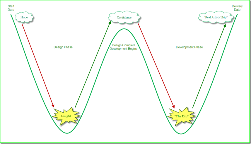
Illustrated above is what I am calling The Winning Curve and it combines ideas from three books I have recently read:

The Winning Curve is applicable to any type of project or the current iteration of an ongoing program—professional or personal.


Insight

The Winning Curve starts with the Design Phase, the characteristics of which are inspired by Tim Brown (quoted in Switch.)  Brown explains how every design phase goes through “foggy periods.”  He uses a U-shaped curve called a “project mood chart” that predicts how people will feel at different stages of the design phase. 

The design phase starts with a peak of positive emotion, labeled “Hope,” and ends with a second peak of positive emotion, labeled “Confidence.”  In between these two great heights is a deep valley of negative emotion, labeled “Insight.”

The design phase, according to Brown, is “rarely a graceful leap from height to height,” and as Harvard Business School professor Rosabeth Moss Kanter explains, “everything can look like a failure in the middle.”

Therefore, the design phase is really exciting—at the beginning

After the reality of all the research, as well as the necessary communication and collaboration with others has a chance to set in, then the hope you started out with quickly dissipates, and insight is the last thing you would expect to find “down in the valley.”

During this stage, “it’s easy to get depressed, because insight doesn’t always strike immediately,” explains Chip and Dan Heath.  “But if the team persists through this valley of angst and doubt, it eventually emerges with a growing sense of momentum.”


“The Dip”

After The Winning Curve has finally reached the exhilarating summit of Confidence Mountain (i.e., your design is completed), you are then faced with yet another descent, since now the Development Phase is ready to begin.

Separating the start of the development phase from the delivery date is another daunting valley, otherwise known as “The Dip.”

The development phase can be downright brutal.  It is where the grand conceptual theory of your design’s insight meets the grunt work practice required by your development’s far from conceptual daily realities. 

Everything sounds easier on paper (or on a computer screen).  Although completing the design phase was definitely a challenge, completing the development phase is almost always more challenging.

However, as Seth Godin explains, “The Dip is where success happens.  Successful people don’t just ride out The Dip.  They don’t just buckle down and survive it.  No, they lean into The Dip.”

“All our successes are the same.  All our failures, too,” explains Godin in the closing remarks of The Dip.  “We succeed when we do something remarkable.  We fail when we give up too soon.”


“Real Artists Ship”

When Steve Jobs said “real artists ship,” he was calling the bluff of a recalcitrant engineer who couldn’t let go of some programming code.  In Linchpin, Seth Godin quotes poet Bruce Ario to explain that “creativity is an instinct to produce.”

Toward the end of the development phase, the Delivery Date forebodingly looms.  The delivery date is when your definition of success will be judged by others, which is why some people prefer the term Judgment Day since it seems far more appropriate.

“The only purpose of starting,” writes Godin, “is to finish, and while the projects we do are never really finished, they must ship.”

Godin explains that the primary challenge to shipping (i.e., completing development by or before your delivery date) is thrashing.

“Thrashing is the apparently productive brainstorming and tweaking we do for a project as it develops.  Thrashing is essential.  The question is: when to thrash?  Professional creators thrash early.  The closer the project gets to completion, the fewer people see it and the fewer changes are permitted.”

Thrashing is mostly about the pursuit of perfection. 

We believe that if what we deliver isn’t perfect, then our efforts will be judged a failure.  Of course, we know that perfection is impossible.  However, our fear of failure is often based on our false belief that perfection was the actual expectation of others. 

Therefore, our fear of failure offers this simple and comforting advice: if you don’t deliver, then you can’t fail.

However, real artists realize that success or failure—or even worse, mediocrity—could be the judgment that they receive after they have delivered.  Success rocks and failure sucks—but only if you don’t learn from it.  That’s why real artists always ship. 


The Winning Curve

I named it “The Winning Curve” both because its shape resembles a “W” and it sounds better than calling it “The Failing Curve.” 

However, the key point is that failure often (if not always) precedes success, and in both our professional and personal lives, most (if not all) of us are pursuing one or more kinds of success—and in these pursuits, we generally view failure as the enemy.

Failure is not the enemy.  In fact, the most successful people realize failure is their greatest ally.

As Thomas Edison famously said, “I didn’t find a way to make a light bulb, I found a thousand ways how not to make one.”

“Even in failure, there is success,” explains Chip and Dan Heath.  Whenever you fail, it’s extremely rare that everything you did was a failure.  Your approach almost always creates a few small sparks in your quest to find a way to make your own light bulb. 

“These flashes of success—these bright spots—can illuminate the road map for action,” according to the Heaths, who also explain that “we will struggle, we will fail, we will be knocked down—but throughout, we’ll get better, and we’ll succeed in the end.”

The Winning Curve can’t guarantee success—only learning.  Unfortunately, the name “The Learning Curve” was already taken.


Related Posts

Persistence

Thinking along the edges of the box

The HedgeFoxian Hypothesis

The Once and Future Data Quality Expert

Mistake Driven Learning

The Fragility of Knowledge

The Wisdom of Failure

A Portrait of the Data Quality Expert as a Young Idiot

Do you believe in Magic (Quadrants)?

Twitter

If you follow Data Quality on Twitter like I do, then you are probably already well aware that the 2010 Gartner Magic Quadrant for Data Quality Tools was released this week (surprisingly, it did not qualify as a Twitter trending topic).

The five vendors that were selected as the “data quality market leaders” were SAS DataFlux, IBM, Informatica, SAP Business Objects, and Trillium.

Disclosure: I am a former IBM employee, former IBM Information Champion, and I blog for the Data Roundtable, which is sponsored by SAS.

Please let me stress that I have the highest respect for both Ted Friedman and Andy Bitterer, as well as their in depth knowledge of the data quality industry and their insightful analysis of the market for data quality tools.

In this blog post, I simply want to encourage a good-natured debate, and not about the Gartner Magic Quadrant specifically, but rather about market research in general.  Gartner is used as the example because they are perhaps the most well-known and the source most commonly cited by data quality vendors during the sales cycle—and obviously, especially by the “leading vendors.”

I would like to debate how much of an impact market research really has on a prospect’s decision to purchase a data quality tool.

Let’s agree to keep this to a very informal debate about how research can affect both the perception and the reality of the market.

Therefore—for the love of all high quality data everywhere—please, oh please, data quality vendors, do NOT send me your quarterly sales figures, or have your PR firm mercilessly spam either my comments section or my e-mail inbox with all the marketing collateral “proving” how Supercalifragilisticexpialidocious your data quality tool is—I said please, so play nice.


The OCDQ View on OOBE-DQ

In a previous post, I used the term OOBE-DQ to refer to the out-of-box-experience (OOBE) provided by data quality (DQ) tools, which usually becomes a debate between “ease of use” and “powerful functionality” after you ignore the Magic Beans sales pitch that guarantees you the data quality tool is both remarkably easy to use and incredibly powerful.

However, the data quality market continues to evolve away from esoteric technical tools and toward business-empowering suites providing robust functionality with easier to use and role-based interfaces that are tailored to the specific needs of different users, such as business analysts, data stewards, application developers, and system administrators.

The major players are still the large vendors who have innovated (mostly via acquisition and consolidation) enterprise application development platforms with integrated (to varying degrees) components, which provide not only data quality functionality, but also data integration and master data management (MDM) as well.

Many of these vendors also offer service-oriented deployments delivering the same functionality within more loosely coupled technical architectures, which includes leveraging real-time services to prevent (or at least greatly minimize) poor data quality at the multiple points of origin within the data ecosystem.

Many vendors are also beginning to provide better built-in reporting and data visualization capabilities, which is helping to make the correlation between poor data quality and suboptimal business processes more tangible, especially for executive management.

It must be noted that many vendors (including the “market leaders”) continue to struggle with their International OOBE-DQ. 

Many (if not most) data quality tools are strongest in their native country or their native language, but their OOBE-DQ declines significantly when they travel abroad.  Especially outside of the United States, smaller vendors with local linguistic and cultural expertise built into their data quality tools have continued to remain fiercely competitive with the larger vendors.

Market research certainly has a role to play in making a purchasing decision, and perhaps most notably as an aid in comparing and contrasting features and benefits, which of course, always have to be evaluated against your specific requirements, including both your current and future needs. 

Now let’s shift our focus to examining some of the inherent challenges of evaluating market research, perception, and reality.


Confirmation Bias

First of all, I realize that this debate will suffer from a considerable—and completely understandable—confirmation bias.

If you are a customer, employee, or consultant for one of the “High Five” (not an “official” Gartner Magic Quadrant term for the Leaders), then obviously you have a vested interest in getting inebriated on your own Kool-Aid (as noted in my disclosure above, I used to get drunk on the yummy Big Blue Kool-Aid).  Now, this doesn’t mean that you are a “yes man” (or a “yes woman”).  It simply means it is logical for you to claim that market research, market perception, and market reality are in perfect alignment.

Likewise, if you are a customer, employee, or consultant for one of the “It Isn’t Easy Being Niche-y” (rather surprisingly, not an “official” Gartner Magic Quadrant term for the Niche Players), then obviously you have a somewhat vested interest in claiming that market research is from Mars, market perception is from Venus, and market reality is really no better than reality television.

And, if you are a customer, employee, or consultant for one of the “We are on the outside looking in, flipping both Gartner and their Magic Quadrant the bird for excluding us” (I think that you can figure out on your own whether or not that is an “official” Gartner Magic Quadrant term), then obviously you have a vested interest in saying that market research can “Kiss My ASCII!”

My only point is that your opinion of market research will obviously be influenced by what it says about your data quality tool. 

Therefore, should it really surprise anyone when, during the sales cycle, one of the High Five uses the Truly Awesome Syllogism:

“Well, of course, we say our data quality tool is awesome.
However, the Gartner Magic Quadrant also says our data quality tool is awesome.
Therefore, our data quality tool is Truly Awesome.”

Okay, so technically, that’s not even a syllogism—but who said any form of logical argument is ever used during a sales cycle?

On a more serious note, and to stop having too much fun at Gartner’s expense, they do advise against simply selecting vendors in their “Leaders quadrant” and instead always advise to select the vendor that is the better match for your specific requirements.


Features and Benefits: The Game Nobody Wins

As noted earlier, a features and benefits comparison is not only the most common technique used by prospects, but it is also the most common—if not the only—way that the vendors themselves position their so-called “competitive differentiation.”

The problem with this approach—and not just for data quality tools—is that there are far more similarities than differences to be found when comparing features and benefits. 

Practically every single data quality tool on the market today will include functionality for data profiling, data quality assessment, data standardization, data matching, data consolidation, data integration, data enrichment, and data quality monitoring.

Therefore, running down a checklist of features is like playing a game of Buzzword Bingo, or constantly playing Musical Chairs, but without removing any of the chairs in between rounds—in others words, the Features Game almost always ends in a tie.

So then next we play the Benefits Game, which is usually equally pointless because it comes down to silly arguments such as “our data matching engine is better than yours.”  This is the data quality tool vendor equivalent of:

Vendor D: “My Dad can beat up your Dad!”

Vendor Q: “Nah-huh!”

Vendor D: “Yah-huh!”

Vendor Q: “NAH-HUH!”

Vendor D: “YAH-HUH!”

Vendor Q: “NAH-HUH!”

Vendor D: “Yah-huh!  Stamp it!  No Erasies!  Quitsies!”

Vendor Q: “No fair!  You can’t do that!”

After both vendors have returned from their “timeout,” a slightly more mature approach is to run a vendor “bake-off” where the dueling data quality tools participate in a head-to-head competition processing a copy of the same data provided by the prospect. 

However, a bake-off often produces misleading results because the vendors—and not the prospect—perform the competition, making it mostly about vendor expertise, not OOBE-DQ.  Also, the data used rarely exemplifies the prospect’s data challenges.

If competitive differentiation based on features and benefits is a game that nobody wins, then what is the alternative?


The Golden Circle
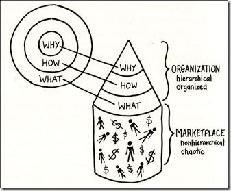
The Golden Circle

I recently read the book Start with Why by Simon Sinek, which explains that “people don’t buy WHAT you do, they buy WHY you do it.” 

The illustration shows what Simon Sinek calls The Golden Circle.

WHY is your purpose—your driving motivation for action. 

HOW is your principles—specific actions that are taken to realize your Why. 

WHAT is your results—tangible ways in which you bring your Why to life. 

It’s a circle when viewed from above, but in reality it forms a megaphone for broadcasting your message to the marketplace. 

When you rely only on the approach of attempting to differentiate your data quality tool by discussing its features and benefits, you are focusing on only your WHAT, and absent your WHY and HOW, you sound just like everyone else to the marketplace.

When, as is often the case, nobody wins the Features and Benefits Game, a data quality tool sounds more like a commodity, which will focus the marketplace’s attention on aspects such as your price—and not on aspects such as your value.

Due to the considerable length of this blog post, I have been forced to greatly oversimplify the message of this book, which a future blog post will discuss in more detail.  I highly recommend the book (and no, I am not an affiliate).

At the very least, consider this question:

If there truly was one data quality tool on the market today that, without question, had the very best features and benefits, then why wouldn’t everyone simply buy that one? 

Of course your data quality tool has solid features and benefits—just like every other data quality tool does.

I believe that the hardest thing for our industry to accept is—the best technology hardly ever wins the sale. 

As most of the best salespeople will tell you, what wins the sale is when a relationship is formed between vendor and customer, a strategic partnership built upon a solid foundation of rapport, respect, and trust.

And that has more to do with WHY you would make a great partner—and less to do with WHAT your data quality tool does.


Do you believe in Magic (Quadrants)?

I Want To Believe

How much of an impact do you think market research has on the purchasing decision of a data quality tool?  How much do you think research affects both the perception and the reality of the data quality tool market?  How much do you think the features and benefits of a data quality tool affect the purchasing decision?

All perspectives on this debate are welcome without bias.  Therefore, please post a comment below.

PLEASE NOTE

Comments advertising your products and services (or bashing competitors) will not be approved.


Channeling My Inner Beagle: The Case for Hyperactivity

UnderDog

Phil Simon, who is a Bulldog’s best friend and is a good friend of mine, recently blogged Channeling My Inner Bulldog: The Case for Stubbornness, in which he described how the distracting nature of multitasking can impair our ability to solve complex problems.

Although I understood every single word he wrote, after three dog nights, I can’t help but take the time to share my joy to the world by channeling my inner beagle and making the case for hyperactivity—in other words, our need to simply become better multitaskers.

The beloved mascot of my blog post is Bailey, not only a great example of a typical Beagle, but also my brother’s family dog, who is striking a heroic pose in this picture while proudly sporting his all-time favorite Halloween costume—Underdog.

I could think of no better hero to champion my underdog of a cause:

“There’s no need to fear . . . hyperactivity!”


Please Note: Just because Phil Simon coincidentally uses “Simon Says” as the heading for all his blog conclusions, doesn’t mean Phil is Simon Bar Sinister, who coincidentally used “Simon Says” to explain his diabolical plans—that’s completely coincidental.


The Power of Less

I recently read The Power of Less, the remarkable book by Leo Babauta, which provides practical advice on simplifying both our professional and personal lives.  The book has a powerfully simple message—identify the essential, eliminate the rest.

I believe that the primary reason multitasking gets such a bad reputation is the numerous non-essential tasks typically included. 

Many daily tasks are simply “busy work” that we either don’t really need to do at all, or don’t need to do as frequently.  We have allowed ourselves to become conditioned to perform certain tasks, such as constantly checking our e-mail and voice mail. 

Additionally, whenever we do find a break in our otherwise hectic day, “nervous energy” often causes us to feel like we should be doing something with our time—and so the vicious cycle of busy work begins all over again.

“Doing nothing is better than being busy doing nothing,” explained Lao Tzu

I personally find that whenever I am feeling overwhelmed by multitasking, it’s not because I am trying to distribute my time among a series of essential tasks—instead, I was really just busy doing a whole lot of nothing.  “Doing a huge number of things,” explains Babauta, “doesn’t mean you’re getting anything meaningful done.”

Meaningful accomplishment requires limiting our focus to only essential tasks.  Unlimited focus, according to Babauta, is like “taking a cup of red dye and pouring it into the ocean, and watching the color dilute into nothingness.  Limited focus is putting that same cup of dye into a gallon of water.”

Only you can decide which tasks are essential.  Look at your “to do list” and first identify the essential—then eliminate the rest.


It’s about the journey—not the destination

Once you have eliminated the non-essential tasks, your next challenge is limiting your focus to only the essential tasks. 

Perhaps the simplest way to limit your focus and avoid the temptation of multitasking altogether is to hyper-focus on only one task at a time.  So let’s use reading a non-fiction book as an example of one of the tasks you identified as essential.

Some people would read this non-fiction book as fast as they possibly can—hyper-focused and not at all distracted—as if they’re trying to win “the reading marathon” by finishing the book in the shortest time possible. 

They claim that this gives them both a sense of accomplishment and allows them to move on to their next essential task, thereby always maintaining their vigilant hyper-focus of performing only one task at a time. 

However, what did they actually accomplish other than simply completing the task of reading the book?

I find people—myself included—that voraciously read non-fiction books often struggle when attempting to explain the book, and in fact, they usually can’t tell you anything more than what you would get from simply reading the jacket cover of the book. 

Furthermore, they often can’t demonstrate any proof of having learned anything from reading the book.  Now, if they were reading fiction, I would argue that’s not a problem.  However, their “undistracted productivity” of reading a non-fiction book can easily amount to nothing more than productive entertainment. 

They didn’t mind the gap between the acquisition of new information and its timely and practical application.  Therefore, they didn’t develop valuable knowledge.  They didn’t move forward on their personal journey toward wisdom. 

All they did was productively move the hands of the clock forward—all they did was pass the time.

Although by eliminating distractions and focusing on only essential tasks, you’ll get more done and reach your destination faster, in my humble opinion, a meaningful life is not a marathon—a meaningful life is a race not to run.

It’s about the journey—not the destination.  In the words of Ralph Waldo Emerson:

“With the past, I have nothing to do; nor with the future.  I live now.”

Hyperactivity is Simply Better Multitasking

Although I do definitely believe in the power of less, the need to eliminate non-essential tasks, and the need to focus my attention, I am far more productive when hyper-active (i.e., intermittently alternating my attention among multiple simultaneous tasks).

Hyperactively collecting small pieces of meaningful information from multiple sources, as well as from the scattered scraps of knowledge whirling around inside my head, is more challenging, and more stressful, than focusing on only one task at a time.

However, at the end of most days, I find that I have made far more meaningful progress on my essential tasks. 

Although, in all fairness, I often breakdown and organize essential tasks into smaller sub-tasks, group similar sub-tasks together, then I multitask within only one group at a time.  This lower-level multitasking minimizes what I call the plate spinning effect, where an interruption can easily cause a disastrous disruption in productivity.

Additionally, I believe that not all distractions are created equal.  Some, in fact, can be quite serendipitous.  Therefore, I usually allow myself to include one “creative distraction” in my work routine.  (Typically, I use either Twitter or some source of music.)

By eliminating non-essential tasks, grouping together related sub-tasks, and truly embracing the chaos of creative distraction, hyperactivity is simply better multitasking—and I think that in the Digital Age, this is a required skill we all must master.


The Rumble in the Dog Park

So which is better?  Stubbornness or Hyperactivity?  In the so-called Rumble in the Dog Park, who wins?  Bulldogs or Beagles? 

I know that I am a Beagle.  Phil knows he is a Bulldog.  I would be unhappy as a Bulldog.  Phil would be unhappy as a Beagle. 

And that is the most important point.

There is absolutely no better way to make yourself unhappy than by trying to live by someone else’s definition of happiness.

You should be whatever kind of dog that truly makes you happy.  In other words, if you prefer single-tasking, then be a Bulldog, and if you prefer multitasking, then be a Beagle—and obviously, Bulldogs and Beagles are not the only doggone choices.

Maybe you’re one of those people who prefers cats—that’s cool too—just be whatever kind of cool cat truly makes you happy. 

Or maybe you’re neither a dog person nor a cat person.  Maybe you’re more of a Red-Eared Slider kind of person—that’s cool too.

And who ever said that you had to choose to be only one kind of person anyway? 

Maybe some days you’re a Beagle, other days you’re a Bulldog, and on weekends and vacation days you’re a Red-Eared Slider. 

It’s all good

Just remember—no matter what—always be you.

The Balancing Act of Awareness

This is my sixth blog post tagged Karma since I promised to discuss it directly and indirectly on my blog throughout the year after declaring KARMA my theme word for 2010 back on the first day of January—surprisingly now almost six months ago.

Lately I have been contemplating the importance of awareness, and far more specifically, the constant challenge involved in maintaining the balance between our self-awareness and our awareness of others.

The three sections below are each prefaced by a chapter from Witter Bynner’s “American poetic” translation of the Tao Te Ching.  I certainly do not wish to offend anyone’s religious sensibilities—I am using these references in a philosophical and secular sense.

Since I also try to balance my philosophy between Eastern and Western influences, Lao Tzu won’t be the only “old master” cited.

Additionally, please note that the masculine language (e.g., “he” and “man”) used in the selected quotes below is a by-product of the age of the original texts (e.g., the Tao Te Ching is over 2,500 years old).  Therefore, absolutely no gender bias is intended.


Self-Awareness

“Nothing can bring you peace but yourself.”  Ralph Waldo Emerson wrote this sentence in the closing lines of his wonderful essay on Self-Reliance, which is one of my all-time favorites even though I first read it over 25 years ago.  My favorite passage is:

“What I must do is all that concerns me, not what the people think.  This rule, equally arduous in actual and in intellectual life, may serve for the whole distinction between greatness and meanness.  It is the harder because you will always find those who think they know what is your duty better than you know it.  It is easy in the world to live after the world’s opinion; it is easy in solitude to live after our own; but the great man is he who in the midst of the crowd keeps with perfect sweetness the independence of solitude.”

Emerson’s belief in the primacy of the individual was certainly not an anti-social sentiment.

Emerson believed society is best served whenever individuals possess a healthy sense of self and a well-grounded self-confidence, both of which can only be achieved if we truly come to know who we are on our own terms.

Writing more than 150 years later, and in one of my all-time favorite non-fiction books, The 7 Habits of Highly Effective People, Stephen Covey explains the importance of first achieving independence through self-mastery before successful interdependence with others is possible.  “Interdependence is a choice only independent people can make,” Covey explained.  “Dependent people cannot choose to become interdependent.  They don’t have the character to do it; they don’t own enough of themselves.”

“Private victories precede public victories,” wrote Covey, explaining that the private victories of independence are the essence of our character growth, and provide the prerequisite foundation necessary for the public victories of interdependence.

Of course, the reality is that self-awareness and independence cannot be developed only during our moments of solitude.

We must interact with others even before we have achieved self-mastery.  Furthermore, self-mastery is a continuous process.  Although self-awareness is essential for effectively interacting with others, it provides no guarantee for social success.

However, as William Shakespeare taught us by way of the character Polonius in Hamlet:

“This above all—to thine own self be true;
And it must follow, as the night the day,
Thou canst not then be false to any man.”

Other-Awareness

Empathy, which is central to our awareness of others (i.e., other-awareness), is often confused with sympathy.

Sympathy is an agreement of feeling that we express by providing support or showing compassion for the suffering of others.  Empathy is an identification with the emotions, thoughts, or perspectives expressed by others.

The key difference is found between the words agreement and identification.

Sympathy is the ability to relate oneself to others.  Empathy is the ability to see the self in others—not your self, but the unique self within each individual.  Sympathy is about trying to comfort others.  Empathy is about trying to understand others.

“Empathy is not sympathy,” explains Covey.  “Sympathy is a form of agreement, a form of judgment.  And it is sometimes the more appropriate response.  But people often feed on sympathy.  It makes them dependent.  The essence of empathy is not that you agree with someone; it’s that you fully, deeply, understand that person, emotionally as well as intellectually.”

Although both sympathy and empathy are important, empathy is more crucial for other-awareness.

We often simply act sympathetic when in the presence of others.  Therefore, sympathy is sometimes all too easy to feign and can easily remain superficial.  Empathy is less ostentatious, but can exert a far more powerfully positive influence over others.

In the words of Roy Schafer, who emphasized the role of narrative (i.e., the interpretation of our life stories) in psychoanalysis:

“Empathy involves the inner experience of sharing in and comprehending the momentary psychological state of another person.”

Balanced Awareness

Although it is easy to be aware of only our good qualities, while at the same time, only be aware of the bad qualities of others, these convenient blind spots in our awareness can also become our greatest teachers. 

Borrowing the wise words of Socrates, which thankfully were recorded for us by Plato:

“The unexamined life is not worth living.”

Examining our awareness, and shifting its focus when appropriate between self-awareness and other-awareness truly requires a delicate balancing act. 

When we become preoccupied with self-awareness, our consideration for others suffers.  Likewise, if we become too focused on other-awareness, we can neglect our own basic needs.

Aristotle wrote about such challenges using what he called the Golden Mean, which is usually simplified into the sage advice:

“Moderation in all things.” 

Obviously, there will be times when self-awareness must be our priority, and other times when it must become other-awareness. 

I believe that there is no such thing as achieving a perfect balance, but if we remain true to our own character, then hopefully a consistency will flow freely throughout all of our behaviors, our actions, and our communication and collaboration with others.


Related Posts

The Importance of Envelopes

The Point of View Paradox

The Challenging Gift of Social Media

True Service

The Game of Darts – An Allegory

“I can make glass tubes”

My #ThemeWord for 2010: KARMA

The Prince of Data Governance

Machiavelli

The difference between politics and policies was explained in the recent blog post A New Dimension in Data Governance Directives: Politics by Jarrett Goldfedder, who also discussed the need to consider the political influences involved, as they can often have a far greater impact on our data governance policies than many choose to recognize.

I definitely agree, especially since the unique corporate culture of every organization carries with it the intricacies and complexities of politics that Niccolò Machiavelli (pictured) wrote about in his book The Prince.

The book, even despite the fact it was written in the early 16th century, remains a great, albeit generally regarded as satirical, view on politics.

The Prince provides a classic study of the acquisition, expansion, and effective use of political power, where the ends always justify the means.

An example of a Machiavellian aspect of the politics of data governance is when a primary stakeholder, while always maintaining the illusion of compliance, only truly complies with policies when it suits the very purposes of their own personal agenda, or when it benefits the interests of the business unit that they represent on the data governance board.


Creating Accountability

In her excellent comment on my recent blog post Jack Bauer and Enforcing Data Governance Policies, Kelle O'Neal provided a link to the great article Creating Accountability by Nancy Raulston, which explains that there is a significant difference between increasing accountability (e.g., for compliance with data governance policies) and simply getting everyone to do what they’re told (especially if you have considered resorting to the use of a Jack Bauer approach to enforcing data governance policies).

Raulston shares her high-level thoughts about the key aspects of alignment with vision and goals, achieving clarity on actions and priorities, establishing ownership of processes and responsibilities, the structure of meetings, and the critical role of active and direct communication—all of which are necessary to create true accountability.

“Accountability does not come from every single person getting every single action item done on time,” explains Raulston.  “It arises as groups actively manage the process of making progress, raising and resolving issues, actively negotiating commitments, and providing direct feedback to team members whose behavior is impeding the team.”

Obviously, this is often easier said than done.  However, as Raulston concludes, “ultimate success comes from each person being willing to honestly engage in the process, believing that the improved probability of success outweighs any momentary discomfort from occasionally having to admit to not having gotten something done.”  Or perhaps more important, occasionally having to be comfortable with not having gotten what would suit their personal agenda, or benefit the interests of their group.


The Art of the Possible

“Right now, our only choice,” as Goldfedder concluded his post, “is to hope that the leaders in charge of the final decisions can put their own political goals aside for the sake of the principles and policies they have been entrusted to uphold and protect.”

Although I agree, as well as also acknowledge that the politics of data governance will always make it as much art as it is science, I can not help but be reminded of the famous words of Otto von Bismarck:

“Politics is the art of the possible.”

The politics of data governance are extremely challenging, and yes, at times rather Machiavellian in their nature. 

Although it is certainly by no means an easy endeavor for either you or your organization to undertake, neither is achieving a successful and sustainable data governance program impossible. 

Politics may be The Prince of Data Governance, but as long as Communication and Collaboration reign as King and Queen, then Data Governance is the Art of the Possible.


Please share your thoughts about the politics of data governance, as well as your overall perspectives on data governance.


Follow OCDQ

If you enjoyed this blog post, then please subscribe to OCDQ via my RSS feed, my E-mail updates, or Google Reader.

You can also follow OCDQ on Twitter, fan the Facebook page for OCDQ, and connect with me on LinkedIn.