Data Quality is not a Magic Trick

Data Quality (DQ) View is an OCDQ regular segment.  Each DQ-View is a brief video discussion of a data quality key concept.

If you are having trouble viewing this video, then you can watch it on Vimeo by clicking on this link: DQ-View on Vimeo

You can also watch a regularly updated page of my videos by clicking on this link: OCDQ Videos


Data Stewards make the Real Magic Happen

By November 4, 2013 nominate a data steward whom you believe should be recognized as the 2013 Data Steward of the Year.


Related Posts

DQ-View: The Five Stages of Data Quality

DQ-View: MetaData makes BettahMusic

DQ-View: Data Is as Data Does

DQ-View: Baseball and Data Quality

DQ-View: Occam’s Razor Burn

DQ-View: Roman Ruts on the Road to Data Governance

DQ-View: Talking about Data

DQ-View: The Poor Data Quality Blizzard

DQ-View: New Data Resolutions

DQ-View: From Data to Decision

DQ View: Achieving Data Quality Happiness

DQ-View: The Cassandra Effect

DQ-View: Is Data Quality the Sun?

DQ-View: Designated Asker of Stupid Questions

The Real Data Value is Business Insight

Data Values for COUNTRY Understanding your data usage is essential to improving its quality, and therefore, you must perform data analysis on a regular basis.

A data profiling tool can help you by automating some of the grunt work needed to begin your data analysis, such as generating levels of statistical summaries supported by drill-down details, including data value frequency distributions (like the ones shown to the left).

However, a common mistake is to hyper-focus on the data values.

Narrowing your focus to the values of individual fields is a mistake when it causes you to lose sight of the wider context of the data, which can cause other errors like mistaking validity for accuracy.

Understanding data usage is about analyzing its most important context—how your data is being used to make business decisions.


“Begin with the decision in mind”

In his excellent recent blog post It’s time to industrialize analytics, James Taylor wrote that “organizations need to be much more focused on directing analysts towards business problems.”  Although Taylor was writing about how, in advanced analytics (e.g., data mining, predictive analytics), “there is a tendency to let analysts explore the data, see what can be discovered,” I think this tendency is applicable to all data analysis, including less advanced analytics like data profiling and data quality assessments.

Please don’t misunderstand—Taylor and I are not saying that there is no value in data exploration, because, without question, it can definitely lead to meaningful discoveries.  And I continue to advocate that the goal of data profiling is not to find answers, but instead, to discover the right questions.

However, as Taylor explained, it is because “the only results that matter are business results” that data analysis should always “begin with the decision in mind.  Find the decisions that are going to make a difference to business results—to the metrics that drive the organization.  Then ask the analysts to look into those decisions and see what they might be able to predict that would help make better decisions.”

Once again, although Taylor is discussing predictive analytics, this cogent advice should guide all of your data analysis.


The Real Data Value is Business Insight

The Real Data Value is Business Insight

Returning to data quality assessments, which create and monitor metrics based on summary statistics provided by data profiling tools (like the ones shown in the mockup to the left), elevating what are low-level technical metrics up to the level of business relevance will often establish their correlation with business performance, but will not establish metrics that drive—or should drive—the organization.

Although built from the bottom-up by using, for the most part, the data value frequency distributions, these metrics lose sight of the top-down fact that business insight is where the real data value lies.

However, data quality metrics such as completeness, validity, accuracy, and uniqueness, which are just a few common examples, should definitely be created and monitored—unfortunately, a single straightforward metric called Business Insight doesn’t exist.

But let’s pretend that my other mockup metrics were real—50% of the data is inaccurate and there is an 11% duplicate rate.

Oh, no!  The organization must be teetering on the edge of oblivion, right?  Well, 50% accuracy does sound really bad, basically like your data’s accuracy is no better than flipping a coin.  However, which data is inaccurate, and far more important, is the inaccurate data actually being used to make a business decision?

As for the duplicate rate, I am often surprised by the visceral reaction it can trigger, such as: “how can we possibly claim to truly understand who our most valuable customers are if we have an 11% duplicate rate?”

So, would reducing your duplicate rate to only 1% automatically result in better customer insight?  Or would it simply mean that the data matching criteria was too conservative (e.g., requiring an exact match on all “critical” data fields), preventing you from discovering how many duplicate customers you have?  (Or maybe the 11% indicates the matching criteria was too aggressive).

My point is that accuracy and duplicate rates are just numbers—what determines if they are a good number or a bad number?

The fundamental question that every data quality metric you create must answer is: How does this provide business insight?

If a data quality (or any other data) metric can not answer this question, then it is meaningless.  Meaningful metrics always represent business insight because they were created by beginning with the business decisions in mind.  Otherwise, your metrics could provide the comforting, but false, impression that all is well, or you could raise red flags that are really red herrings.

Instead of beginning data analysis with the business decisions in mind, many organizations begin with only the data in mind, which results in creating and monitoring data quality metrics that provide little, if any, business insight and decision support.

Although analyzing your data values is important, you must always remember that the real data value is business insight.


Related Posts

The First Law of Data Quality

Adventures in Data Profiling

Data Quality and the Cupertino Effect

Is your data complete and accurate, but useless to your business?

The Idea of Order in Data

You Can’t Always Get the Data You Want

Red Flag or Red Herring? 

DQ-Tip: “There is no point in monitoring data quality…”

Which came first, the Data Quality Tool or the Business Need?

Selling the Business Benefits of Data Quality

The Road of Collaboration

The Road Not Taken by Robert Frost I grew up and lived most of my life in the suburbs of Boston, Massachusetts.  But just prior to relocating to the Midwest for work seven years ago, I lived in Derry, New Hampshire, just down the road from the historic landmark where Robert Frost, the famous American poet who was also a four-time recipient of the Pulitzer Prize for Poetry, wrote many of his best poems, including the one shown to the left, The Road Not Taken, which has always remained one of my favorite poems—and also provides the inspiration for this blog post.

Historically, there have been only two “roads” diverged in the corporate world, two well-traveled ways: The Road of Business and The Road of Technology.

Although these two roads have a common starting point near the center of an organization, they will almost always extend away from each other, and in completely opposite directions, leaving most employees to choose which road they wish to travel—often without being sorry that they could not travel both.

I don’t believe that I am taking too much of a poetic license in describing this common calamity as how an organization is “a house divided against itself,” which to paraphrase Abraham Lincoln, cannot succeed.  I believe that no organization can succeed as half business and half technical.  But I also do not believe that any organization must become either all business or all technical.

There is a third option—there is a third road diverged in the corporate world.

Organizations struggle with the business/technical divided house because they believe the corporate world is comprised of technical workers delivering and maintaining the things that enable business workers to do their things.

And of course, there can be an almost Lincoln–Douglas debate about what exactly each of those things are because, in part, it is commonly perceived that they operate independently of one another—whereas the truth is that they are highly interdependent.

However, it’s no debate that organizations suffer from this perception of a deep divide separating the business side of the house, who usually own its data and understand its use in making critical daily business decisions, from the technical side of the house, who usually own and maintain its hardware and software infrastructure, which comprise its enterprise data architecture.

The success of all enterprise information initiatives is highly dependent upon enterprise-wide interdependence—aka collaboration.

Therefore, in order for success to be possible with data quality, data integration, master data management, data warehousing, business intelligence, data governance, etc., your organization needs to travel the third road diverged in the corporate world.

The Road of Collaboration is long and winding, a seemingly strange and unfamiliar road, quite distinct from the well-traveled, long, but straight and narrow, and somewhat easily foreseeable paths of The Road of Business and The Road of Technology.

Your organization must abandon the comforts of the familiar roads and embrace the discomfort of the unfamiliar road, the road that although less traveled by, definitely makes all the difference between whether your entire house will succeed or fail.

But if The Road of Collaboration does not yet exist within your organization, then you can not afford to settle for continuing to travel down whatever path you currently follow.  Instead, you must follow the trailblazing advice of Ralph Waldo Emerson:

“Do not go where the path may lead; go instead where there is no path and leave a trail.”

Neither trailblazing, nor taking the road less traveled by, will be an easy journey.  And there is no escaping the harsh reality that The Road of Collaboration will always be the path of the greatest resistance.

But which story do you want to be telling—and without a sigh—somewhere ages and ages hence?

Do you want to tell the story about how your organization continued to walk away from each other by traveling separately down The Road of Business and The Road of Technology—leaving The Road of Collaboration as The Road Not Taken?

Or do you want to tell the story about how your organization chose to walk together by traveling The Road of Collaboration?

Three roads diverged in the corporate world, and our organization—
Our organization took the one less traveled by,
And that has made all the difference.

Related Posts

Scrum Screwed Up

The Idea of Order in Data

Finding Data Quality

Data Transcendentalism

Declaration of Data Governance

The Prince of Data Governance

Jack Bauer and Enforcing Data Governance Policies

Podcast: Business Technology and Human-Speak

The Dumb and Dumber Guide to Data Quality

Not So Strange Case of Dr. Technology and Mr. Business

The Tooth Fairy of Data Quality

Tooth Fairy

The 2010 movie Tooth Fairy was a box office bust—and deservedly so for obvious reasons.  The studio executives couldn’t handle the tooth, er I mean, the truth, which is before Jim Piddock stole, modified, and sold my idea, the original plot centered around Dwayne “The DQ Expert” Johnson, who is a dentist by day, but at night becomes a crime fighter battling poor data quality, who is known only as The Tooth Fairy of Data Quality.

Okay, so obviously the real truth that’s all too easy to handle is that nobody really stole my idea for a movie about a data quality crime fighter who uses the tag line: “Can you smell the bad data The DQ Expert is cleansing?”

However, some of the organizations that I discuss data quality with seem like they really do believe in The Tooth Fairy of Data Quality

No, they don’t literally put their poor quality data under their pillow at night, going to sleep believing when they wake up the next morning that they will magically have high quality data—or at least get $1 for every bad data record.

But they do often act as if they believe that simply loading all of their existing data into a shiny new system, like say an enterprise data warehouse (EDW) or a master data management (MDM) hub, will magically resolve all of their enterprise-wide data issues, resulting in brightly smiling, happy business users.


Data Quality Fairy Tales

Please post a comment below and share your experiences dealing with this or any other fairy tales about data quality that you have encountered.  Perhaps we could even collectively create a new literary or movie genre for Data Quality Fairy Tales.


Anatomy of an OCDQ Blog Post

Since I am often asked by my readers where I get the wacky ideas for some of my data quality blog posts, I thought I would share the Twitter-aided thought process that lead—really quite inevitably—to the writing of this particular blog post:

Therefore, special thanks to Robert Karel of Forrester Research and Steve Sarsfield of Talend for “inspiring” this blog post.


Related Posts

Finding Data Quality

The Quest for the Golden Copy

Oh, the Data You’ll Show!

My Own Private Data

The Tell-Tale Data

Data Quality is People!

There are no Magic Beans for Data Quality

Scrum Screwed Up

This was the inaugural cartoon on Implementing Scrum by Michael Vizdos and Tony Clark, which does a great job of illustrating the fable of The Chicken and the Pig used to describe the two types of roles involved in Scrum, which, quite rare for our industry, is not an acronym, but one common approach among many iterative, incremental frameworks for agile software development.

Scrum is also sometimes used as a generic synonym for any agile framework.  Although I’m not an expert, I’ve worked on more than a few agile programs.  And since I am fond of metaphors, I will use the Chicken and the Pig to describe two common ways that scrums of all kinds can easily get screwed up:

  1. All Chicken and No Pig
  2. All Pig and No Chicken

However, let’s first establish a more specific context for agile development using one provided by a recent blog post on the topic.


A Contrarian’s View of Agile BI

In her excellent blog post A Contrarian’s View of Agile BI, Jill Dyché took a somewhat unpopular view of a popular view, which is something that Jill excels at—not simply for the sake of doing it—because she’s always been well-known for telling it like it is.

In preparation for the upcoming TDWI World Conference in San Diego, Jill was pondering the utilization of agile methodologies in business intelligence (aka BI—ah, there’s one of those oh so common industry acronyms straight out of The Acronymicon).

The provocative TDWI conference theme is: “Creating an Agile BI Environment—Delivering Data at the Speed of Thought.”

Now, please don’t misunderstand.  Jill is an advocate for doing agile BI the right way.  And it’s certainly understandable why so many organizations love the idea of agile BI.  Especially when you consider the slower time to value of most other approaches when compared with, following Jill’s rule of thumb, how agile BI would have “either new BI functionality or new data deployed (at least) every 60-90 days.  This approach establishes BI as a program, greater than the sum of its parts.”

“But in my experience,” Jill explained, “if the organization embracing agile BI never had established BI development processes in the first place, agile BI can be a road to nowhere.  In fact, the dirty little secret of agile BI is this: It’s companies that don’t have the discipline to enforce BI development rigor in the first place that hurl themselves toward agile BI.”

“Peek under the covers of an agile BI shop,” Jill continued, “and you’ll often find dozens or even hundreds of repeatable canned BI reports, but nary an advanced analytics capability. You’ll probably discover an IT organization that failed to cultivate solid relationships with business users and is now hiding behind an agile vocabulary to justify its own organizational ADD. It’s lack of accountability, failure to manage a deliberate pipeline, and shifting work priorities packaged up as so much scrum.”

I really love the term Organizational Attention Deficit Disorder, and in spite of myself, I can’t help but render it acronymically as OADD—which should be pronounced as “odd” because the “a” is silent, as in: “Our organization is really quite OADD, isn’t it?”


Scrum Screwed Up: All Chicken and No Pig

Returning to the metaphor of the Scrum roles, the pigs are the people with their bacon in the game performing the actual work, and the chickens are the people to whom the results are being delivered.  Most commonly, the pigs are IT or the technical team, and the chickens are the users or the business team.  But these scrum lines are drawn in the sand, and therefore easily crossed.

Many organizations love the idea of agile BI because they are thinking like chickens and not like pigs.  And the agile life is always easier for the chicken because they are only involved, whereas the pig is committed.

OADD organizations often “hurl themselves toward agile BI” because they’re enamored with the theory, but unrealistic about what the practice truly requires.  They’re all-in when it comes to the planning, but bacon-less when it comes to the execution.

This is one common way that OADD organizations can get Scrum Screwed Up—they are All Chicken and No Pig.


Scrum Screwed Up: All Pig and No Chicken

Closer to the point being made in Jill’s blog post, IT can pretend to be pigs making seemingly impressive progress, but although they’re bringing home the bacon, it lacks any real sizzle because it’s not delivering any real advanced analytics to business users. 

Although they appear to be scrumming, IT is really just screwing around with technology, albeit in an agile manner.  However, what good is “delivering data at the speed of thought” when that data is neither what the business is thinking, nor truly needs?

This is another common way that OADD organizations can get Scrum Screwed Up—they are All Pig and No Chicken.


Scrum is NOT a Silver Bullet

Scrum—and any other agile framework—is not a silver bullet.  However, agile methodologies can work—and not just for BI.

But whether you want to call it Chicken-Pig Collaboration, or Business-IT Collaboration, or Shiny Happy People Holding Hands, a true enterprise-wide collaboration facilitated by a cross-disciplinary team is necessary for any success—agile or otherwise.

Agile frameworks, when implemented properly, help organizations realistically embrace complexity and avoid oversimplification, by leveraging recurring iterations of relatively short duration that always deliver data-driven solutions to business problems. 

Agile frameworks are successful when people take on the challenge united by collaboration, guided by effective methodology, and supported by enabling technology.  Agile frameworks allow the enterprise to follow what works, for as long as it works, and without being afraid to adjust as necessary when circumstances inevitably change.

For more information about Agile BI, follow Jill Dyché and TDWI World Conference in San Diego, August 15-20 via Twitter.

Dilbert, Data Quality, Rabbits, and #FollowFriday

For truly comic relief, there is perhaps no better resource than Scott Adams and the Dilbert comic strip

Special thanks to Jill Wanless (aka @sheezaredhead) for tweeting this recent Dilbert comic strip, which perfectly complements one of the central themes of this blog post.


Data Quality: A Tail of Two Rabbits

Since this recent tweet of mine understandably caused a little bit of confusion in the Twitterverse, let me attempt to explain. 

In my recent blog post Who Framed Data Entry?, I investigated that triangle of trouble otherwise known as data, data entry, and data quality, where I explained that although high quality data can be a very powerful thing, since it’s a corporate asset that serves as a solid foundation for business success, sometimes in life, when making a critical business decision, what appears to be bad data is the only data we have—and one of the most commonly cited root causes of bad data is the data entered by people.

However, as my good friend Phil Simon facetiously commented, “there’s no such thing as a people-related data quality issue.”

And, as always, Phil is right.  All data quality issues are caused—not by people—but instead, by one of the following two rabbits:

Roger Rabbit
Roger Rabbit

Harvey Rabbit
Harvey Rabbit

Roger is the data quality trickster with the overactive sense of humor, which can easily handcuff a data quality initiative because he’s always joking around, always talking or tweeting or blogging or surfing the web.  Roger seems like he’s always distracted.  He never seems focused on what he’s supposed to be doing.  He never seems to take anything about data quality seriously at all. 

Well, I guess th-th-th-that’s all to be expected folks—after all, Roger is a cartoon rabbit, and you know how looney ‘toons can be.

As for Harvey, well, he’s a rabbit of few words, but he takes data quality seriously—he’s a bit of a perfectionist about it, actually.  Harvey is also a giant invisible rabbit who is six feet tall—well, six feet, three and a half inches tall, to be complete and accurate.

Harvey and I sit in bars . . . have a drink or two . . . play the jukebox.  And soon, all the other so-called data quality practitioners turn toward us and smile.  And they’re saying, “We don’t know anything about your data, mister, but you’re a very nice fella.” 

Harvey and I warm ourselves in these golden moments.  We’ve entered a bar as lonely strangers without any friends . . . but then we have new friends . . . and they sit with us . . . and they drink with us . . . and they talk to us about their data quality problems. 

They tell us about big terrible things they’ve done to data and big wonderful things they’ll do with their new data quality tools. 

They tell us all about their data hopes and their data regrets, and they tell us all about their golden copies and their data defects.  All very large, because nobody ever brings anything small into a data quality discussion at a bar.  And then I introduce them to Harvey . . . and he’s bigger and grander than anything that anybody’s data quality tool has ever done for me or my data.

And when they leave . . . they leave impressed.  Now, it’s true . . . yes, it’s true that the same people seldom come back, but that’s just data quality envy . . . there’s a little bit of data quality envy in even the very best of us so-called data quality practitioners.

Well, thank you Harvey!  I always enjoy your company too. 

But, you know Harvey, maybe Roger has a point after all.  Maybe the most important thing is to always maintain our sense of humor about data quality.  Like Roger always says—yes, Harvey, Roger always says because Roger never shuts up—Roger says:

“A laugh can be a very powerful thing.  Why, sometimes in life, it’s the only weapon we have.”

Really great non-rabbits to follow on Twitter

Since this blog post was published on a Friday, which for Twitter users like me means it’s FollowFriday, I would like to conclude by providing a brief list of some really great non-rabbits to follow on Twitter.

(Please Note: This is by no means a comprehensive list, is listed in no particular order whatsoever, and no offense is intended to any of my tweeps not listed below.  I hope that everyone has a great #FollowFriday and an even greater weekend.)


Related Posts

Comic Relief: Dilbert on Project Management

Comic Relief: Dilbert to the Rescue

Who Framed Data Entry?

A Tale of Two Q’s

Twitter, Meaningful Conversations, and #FollowFriday

The Fellowship of #FollowFriday

Video: Twitter #FollowFriday – January 15, 2010

Social Karma (Part 7)

Worthy Data Quality Whitepapers (Part 3)

In my April 2009 blog post Data Quality Whitepapers are Worthless, I called for data quality whitepapers worth reading.

This post is now the third entry in an ongoing series about data quality whitepapers that I have read and can endorse as worthy.


Matching Technology Improves Data Quality

Steve Sarsfield recently published Matching Technology Improves Data Quality, a worthy data quality whitepaper, which is a primer on the elementary principles, basic theories, and strategies of record matching.

This free whitepaper is available for download from Talend (requires registration by providing your full contact information).

The whitepaper describes the nuances of deterministic and probabilistic matching and the algorithms used to identify the relationships among records.  It covers the processes to employ in conjunction with matching technology to transform raw data into powerful information that drives success in enterprise applications, including customer relationship management (CRM), data warehousing, and master data management (MDM).

Steve Sarsfield is the Talend Data Quality Product Marketing Manager, and author of the book The Data Governance Imperative and the popular blog Data Governance and Data Quality Insider.


Whitepaper Excerpts

Excerpts from Matching Technology Improves Data Quality:

  • “Matching plays an important role in achieving a single view of customers, parts, transactions and almost any type of data.”
  • “Since data doesn’t always tell us the relationship between two data elements, matching technology lets us define rules for items that might be related.”
  • “Nearly all experts agree that standardization is absolutely necessary before matching.  The standardization process improves matching results, even when implemented along with very simple matching algorithms.  However, in combination with advanced matching techniques, standardization can improve information quality even more.”
  • “There are two common types of matching technology on the market today, deterministic and probabilistic.”
  • “Deterministic or rules-based matching is where records are compared using fuzzy algorithms.”
  • “Probabilistic matching is where records are compared using statistical analysis and advanced algorithms.”
  • “Data quality solutions often offer both types of matching, since one is not necessarily superior to the other.”
  • “Organizations often evoke a multi-match strategy, where matching is analyzed from various angles.”
  • “Matching is vital to providing data that is fit-for-use in enterprise applications.”
 

Related Posts

Identifying Duplicate Customers

Customer Incognita

To Parse or Not To Parse

The Very True Fear of False Positives

Data Governance and Data Quality

Worthy Data Quality Whitepapers (Part 2)

Worthy Data Quality Whitepapers (Part 1)

Data Quality Whitepapers are Worthless

Wednesday Word: August 11, 2010

Wednesday Word is an OCDQ regular segment intended to provide an occasional alternative to my Wordless Wednesday posts.  Wednesday Word provides a word (or words) of the day, including both my definition and an example of recommended usage.


Quality-ish

Truthiness by Stephen Colbert

Definition – Similar to truthiness, which my mentor Sir Dr. Stephen T. Colbert, D.F.A. defines as “truth that a person claims to know intuitively from the gut without regard to evidence, logic, intellectual examination, or facts,” quality-ish is defined as the quality of the data that an organization is using as the basis to make its critical business decisions without regard to performing data analysis, measuring completeness and accuracy, or even establishing if the data has any relevance at all to the critical business decisions being based upon it.

Example – “At today’s press conference, the CIO of Acme Marketplace Analytics heralded data-driven decision-making as the company’s key competitive differentiator.  In related news, the stock price of Acme Marketplace Analytics fell to a record low after their new quality-ish report declared the obsolesce of iTunes based on the latest Betamax videocassette sales projections.”


Is your organization basing its critical business decisions upon high quality data or highly quality-ish data?


Related Posts

The Circle of Quality

Is your data complete and accurate, but useless to your business?

Finding Data Quality

The Dumb and Dumber Guide to Data Quality

Wednesday Word: June 23, 2010 – Referential Narcissisity

Wednesday Word: June 9, 2010 – C.O.E.R.C.E.

Wednesday Word: April 28, 2010 – Antidisillusionmentarianism

Wednesday Word: April 21, 2010 – Enterpricification

Wednesday Word: April 7, 2010 – Vendor Asskisstic

Which came first, the Data Quality Tool or the Business Need?

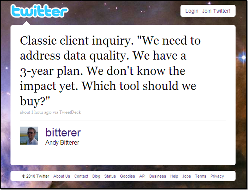
This recent tweet by Andy Bitterer of Gartner Research (and ANALYSTerical) sparked an interesting online discussion, which was vaguely reminiscent of the classic causality dilemma that is commonly stated as “which came first, the chicken or the egg?”


An E-mail from the Edge

On the same day I saw Andy’s tweet, I received an e-mail from a friend and fellow data quality consultant, who had just finished a master data management (MDM) and enterprise data warehouse (EDW) project, which had over 20 customer data sources.

Although he was brought onto the project specifically for data cleansing, he was told from the day of his arrival that because of time constraints, they decided against performing any data cleansing with their recently purchased data quality tool.  Instead, they decided to use their data integration tool to simply perform the massive initial load into their new MDM hub and EDW.

But wait—the story gets even better.  The very first decision this client made was to purchase a consolidated enterprise application development platform with seamlessly integrated components for data quality, data integration, and master data management.

So long before this client had determined their business need, they decided that they needed to build a new MDM hub and EDW, made a huge investment in an entire platform of technology, then decided to use only the basic data integration functionality. 

However, this client was planning to use the real-time data quality and MDM services provided by their very powerful enterprise application development platform to prevent duplicates and any other bad data from entering the system after the initial load. 

But, of course, no one on the project team was actually working on configuring any of those services, or even, for that matter, determining the business rules those services would enforce.  Maybe the salesperson told them it was as easy as flipping a switch?

My friend (especially after looking at the data), preached data quality was a critical business need, but he couldn’t convince them, even despite taking the initiative to present the results of some quick data profiling, standardization, and data matching used to identify duplicate records within and across their primary data sources, which clearly demonstrated the level of poor data quality.

Although this client agreed that they definitely had some serious data issues, they still decided against doing any data cleansing and wanted to just get the data loaded.  Maybe they thought they were loading the data into one of those self-healing databases?

The punchline—this client is a financial services institution with a business need to better identify their most valuable customers.

As my friend lamented at the end of his e-mail, why do clients often later ask why these types of projects fail?


Blind Vendor Allegiance

In his recent blog post Blind Vendor Allegiance Trumps Utility, Evan Levy examined this bizarrely common phenomenon of selecting a technology vendor without gathering requirements, reviewing product features, and then determining what tool(s) could best help build solutions for specific business problems—another example of the tool coming before the business need.

Evan was recounting his experiences at a major industry conference on MDM, where people were asking his advice on what MDM vendor to choose, despite admitting “we know we need MDM, but our company hasn’t really decided what MDM is.”

Furthermore, these prospective clients had decided to default their purchasing decision to the technology vendor they already do business with, in other words, “since we’re already a [you can just randomly insert the name of a large technology vendor here] shop, we just thought we’d buy their product—so what do you think of their product?”

“I find this type of question interesting and puzzling,” wrote Evan.  “Why would anyone blindly purchase a product because of the vendor, rather than focusing on needs, priorities, and cost metrics?  Unless a decision has absolutely no risk or cost, I’m not clear how identifying a vendor before identifying the requirements could possibly have a successful outcome.”


SaaS-y Data Quality on a Cloudy Business Day?

Emerging industry trends like open source, cloud computing, and software as a service (SaaS) are often touted as less expensive than traditional technology, and I have heard some use this angle to justify buying the tool before identifying the business need.

In his recent blog post Cloud Application versus On Premise, Myths and Realities, Michael Fauscette examined the return on investment (ROI) versus total cost of ownership (TCO) argument quite prevalent in the SaaS versus on premise software debate.

“Buying and implementing software to generate some necessary business value is a business decision, not a technology decision,” Michael concluded.  “The type of technology needed to meet the business requirements comes after defining the business needs.  Each delivery model has advantages and disadvantages financially, technically, and in the context of your business.”


So which came first, the Data Quality Tool or the Business Need?

This question is, of course, absurd because, in every rational theory, the business need should always come first.  However, in predictably irrational real-world practice, it remains a classic causality dilemma for data quality related enterprise information initiatives such as data integration, master data management, data warehousing, business intelligence, and data governance.

But sometimes the data quality tool was purchased for an earlier project, and despite what some vendor salespeople may tell you, you don’t always need to buy new technology at the beginning of every new enterprise information initiative. 

Whenever, and before defining your business need, you already have the technology in-house (or you have previously decided, often due to financial constraints, that you will need to build a bespoke solution), you still need to avoid technology bias.

Knowing how the technology works can sometimes cause a framing effect where your business need is defined in terms of the technology’s specific functionality, thereby framing the objective as a technical problem instead of a business problem.

Bottom line—your business problem should always be well-defined before any potential technology solution is evaluated.


Related Posts

There are no Magic Beans for Data Quality

Do you believe in Magic (Quadrants)?

Is your data complete and accurate, but useless to your business?

Can Enterprise-Class Solutions Ever Deliver ROI?

Selling the Business Benefits of Data Quality

The Circle of Quality

The Idea of Order in Data

As I explained in my previous post, which used the existentialist philosophy of Jean-Paul Sartre to explain the existence of the data silos that each and every one of an organization’s business units rely on for maintaining their own version of the truth, I am almost as obsessive-compulsive about literature and philosophy as I am about data and data quality.

Therefore, since my previous post was inspired by philosophy, I decided that this blog post should be inspired by literature.


Wallace Stevens

Although he consistently received critical praise for his poetry, Wallace Stevens spent most of his life working as a lawyer in the insurance industry.  After winning the Pulitzer Prize for Poetry in 1955, he was offered a faculty position at his alma mater, Harvard University, but declined since it would have required his resignation from his then executive management position. 

Therefore, Wallace Stevens was somewhat unique in the sense he was successful both as an artist and as a business professional, which is one of the many reasons why he remains one of my favorite American poets.

Stevens believed that reality is the by-product of our imagination as we use it to shape the constantly changing world around us.  Since change is the only constant in the universe, reality must be acknowledged as an activity, whereby we are constantly trying to make sense of the world through our re-imagining of it—our endless quest to discover order and meaning amongst the chaos.


The Idea of Order in Data

The Idea of Order at Key West by Wallace Stevens

This is an excerpt from The Idea of Order at Key West, one of my favorite Wallace Stevens poems, which provides an example of how our re-imagining of reality shapes the world around us, and allows us to discover order and meaning amongst the chaos.

“People cling to their personal data sets,” explained James Standen of Datamartist in his comment on my previous post.

Even though their business unit’s data silos are “insulated from all those wrong ideas” created and maintained by the data silos of other business units, as Standen wisely points out, all data silos are often considered “not personal enough for the individual.”

“Microsoft Excel lets people create micro-data silos,” Standen continued.  These micro-data silos (i.e., their personal spreadsheets) are “complete (for them), accurate (for them, or at least, they can pretend they are) and constant (in that no matter how much the data in the source system or other people’s spreadsheets change, their spreadsheet will be comfortingly static).  It doesn’t matter what the truth is, as long as they believe their version, and insulate themselves from dissenting views/data sets.”

This insidious pursuit truly becomes a Single Version of the Truth because it represents an individual’s version of the truth. 

The individual is the single artificer of the only world for them—the one that their own private data describes—thereby allowing them to discover their own personal order and meaning amongst the chaos of other, and often conflicting, versions of the truth. 

However, any single version of the truth will only discover a comfortingly static, and therefore false order, as well as an artificial, and therefore misleading meaning, amongst the chaos.

Data is a by-product of our re-imagining of reality.  Data is our abstract description of real-world entities (i.e., “master data”) and the real-world interactions (i.e., “transaction data”) among entities.  Our creation and maintenance of these abstract descriptions of reality shapes our perception of the constantly changing and rapidly evolving business world around us. 

Since change is the only constant, we must acknowledge that The Idea of Order in Data requires a constant activity, whereby we are constantly trying to make sense of the business world through our analysis of the data that describes it, which requires our endless quest to discover the business insight amongst the data chaos.

This quest is bigger than a single individual—or a single business unit.  This quest truly requires an enterprise-wide collaboration, a shared purpose that dissolves the barriers—data silos, politics, and any others—which separate business units and individuals.

The Idea of Order in Data is a quest for a Shared Version of the Truth.


Related Posts

Hell is other people’s data

My Own Private Data

Beyond a “Single Version of the Truth”

Finding Data Quality

The Circle of Quality

Is your data complete and accurate, but useless to your business?

Declaration of Data Governance

The Prince of Data Governance

Hell is other people’s data

I just read the excellent blog post Data Migration – and existentialist angst by John Morris, which asks the provocative question what can the philosophy of Jean-Paul Sartre tell us about data migration?

As a blogger almost as obsessive-compulsive about literature and philosophy as I am about data, this post resonated with me.  But perhaps Neil Raden is right when he remarked on Twitter that “anyone who works in Jean-Paul Sartre with data migration should get to spend 90 days with Lindsay Lohan.  Curse of liberal arts education.” (Please Note: Lindsay’s in jail for 90 days).

Part of my liberal arts education (and for awhile I was a literature major with a minor in philosophy) included reading Sartre, not only his existentialist philosophy, but also his literature, including the play No Exit, which is the source of perhaps his most famous quote: “l’enfer, c’est les autres” (“Hell is other people”) that I have paraphrased into the title of this blog post.


Being and Nothingness

John Morris used Jean-Paul Sartre’s classic existentialist essay Being and Nothingness, and more specifically, two of its concepts, namely that objects are “en-soi” (“things in themselves”) and people are “pour-soi” (“things for themselves”), to examine the complex relationship that is formed during data analysis between the data (an object) and its analyst (a person).

During data analysis, the analyst is attempting to discover the meaning of data, which is determined by discovering its essential business use.  However, in the vast majority of cases, data has multiple business uses.

This is why, as Morris explains, first of all, we should beware “the naive simplicity of assuming that understanding meaning is easy, that there is one right definition.  The relationship between objects and their essential meanings is far more problematic.”

Therefore, you need not worry, for as Morris points out, “it’s not because you are no good at your job and should seek another trade that you can’t resolve the contradictions.  It’s a problem that has confused some of the greatest minds in history.”

“Secondly,” as Morris continues, we have to acknowledge that “we have the technology we have.  By and large, it limits itself to a single meaning, a single Canonical Model.  What we have to do is get from the messy first problem to the simpler compromise of the second view.  There’s no point hiding away from this as an essential part of our activity.”


The complexity of the external world

“Machines are en-soi objects that create en-soi objects,” Morris explains, whereas “people are pour-soi consciousnesses that create meanings and instantiate them in the records they leave behind in the legacy data stores we then have to re-interpret.”

“We then waste time using the wrong tools (e.g., trying to impose an enterprise view onto our business domain experts which is inconsistent with their divergent understandings) only to be surprised and frustrated when our definitions are rejected.”

As I have written about in previous posts, whether it’s an abstract description of real-world entities (i.e., “master data”) or an abstract description of real-world interactions (i.e., “transaction data”) among entities, data is an abstract description of reality.

These abstract descriptions can never be perfected since there is always what I call a digital distance between data and reality.

The inconvenient truth is that reality is not the same thing as the beautifully maintained digital data worlds that exist within our enterprise systems (and, of course, creating and maintaining these abstract descriptions of reality is no easy task).

As Morris thoughtfully concludes, we must acknowledge that “this central problem of the complexity of the external world is against the necessary simplicity of our computer world.”


Hell is other people’s data

The inconvenient truth of the complexity of the external world plays a significant role within the existentialist philosophy of an organization’s data silos, which are also the bane of successful enterprise information management. 

Each and every business unit acts as a pour-soi (a thing for themselves), persisting on their reliance on their own data silos, thereby maintaining their own version of the truth—because they truly believe that hell is other people’s data.

DQ-View: The Cassandra Effect

Data Quality (DQ) View is an OCDQ regular segment.  Each DQ-View is a brief video discussion of a data quality key concept.

When you present the business case for your data quality initiative to executive management and other corporate stakeholders, you need to demonstrate that poor data quality is not a myth—it is a real business problem that negatively impacts the quality of decision-critical enterprise information.

But a common mistake when selling the business benefits of data quality is focusing too much on the negative aspects of not investing in data quality.  Although you would be telling the truth, nobody may want to believe things are as bad as you claim.

Therefore, in this new DQ-View segment, I want to discuss avoiding what is sometimes referred to as “the Cassandra Effect.”


DQ-View: The Cassandra Effect


If you are having trouble viewing this video, then you can watch it on Vimeo by clicking on this link: DQ-View on Vimeo


Related Posts

Selling the Business Benefits of Data Quality

The Only Thing Necessary for Poor Data Quality

Sneezing Data Quality

Why is data quality important?

Data Quality in Five Verbs

The Five Worst Elevator Pitches for Data Quality

Resistance is NOT Futile

Common Change

Selling the Business Benefits of Data Quality

Mr. ZIP In his book Purple Cow: Transform Your Business by Being Remarkable, Seth Godin used many interesting case studies of effective marketing.  One of them was the United States Postal Services.

“Very few organizations have as timid an audience as the United States Postal Service,” explained Godin.  “Dominated by conservative big customers, the Postal Service has a very hard time innovating.  The big direct marketers are successful because they’ve figured out how to thrive under the current system.  Most individuals are in no hurry to change their mailing habits, either.”

“The majority of new policy initiatives at the Postal Service are either ignored or met with nothing but disdain.  But ZIP+4 was a huge success.  Within a few years, the Postal Service diffused a new idea, causing a change in billions of address records in thousands of databases.  How?”

Doesn’t this daunting challenge sound familiar?  An initiative causing a change in billions of records across multiple databases? 

Sounds an awful lot like a massive data cleansing project, doesn’t it?  If you believe selling the business benefits of data quality, especially on such an epic scale, is easy to do, then stop reading right now—and please publish a blog post about how you did it.


Going Postal on the Business Benefits

Getting back to Godin’s case study, how did the United States Postal Service (USPS) sell the business benefits of ZIP+4?

“First, it was a game-changing innovation,” explains Godin.  “ZIP+4 makes it far easier for marketers to target neighborhoods, and much faster and easier to deliver the mail.  ZIP+4 offered both dramatically increased speed in delivery and a significantly lower cost for bulk mailers.  These benefits made it worth the time it took mailers to pay attention.  The cost of ignoring the innovation would be felt immediately on the bottom line.”

Selling the business benefits of data quality (or anything else for that matter) requires defining its return on investment (ROI), which always comes from tangible business impacts, such as mitigated risks, reduced costs, or increased revenue.

Reducing costs was a major selling point for ZIP+4.  Additionally, it mitigated some of the risks associated with direct marketing campaigns, such as the ability to target neighborhoods more accurately, as well as reduce delays in postal delivery times.

However, perhaps the most significant selling point was that “the cost of ignoring the innovation would be felt immediately on the bottom line.”  In other words, the USPS articulated very well that the cost of doing nothing was very tangible.

The second reason ZIP+4 was a huge success, according to Godin, was that the USPS “wisely singled out a few early adopters.  These were individuals in organizations that were technically savvy and were extremely sensitive to both pricing and speed issues.  These early adopters were also in a position to sneeze the benefits to other, less astute, mailers.”

Sneezing the benefits is a reference to another Seth Godin book, Unleashing the Ideavirus, where he explains how the most effective business ideas are the ones that spread.  Godin uses the term ideavirus to describe an idea that spreads, and the term sneezers to describe the people who spread it.

In my blog post Sneezing Data Quality, I explained that it isn’t easy being sneezy, but true sneezers are the innovators and disruptive agents within an organization.  They can be the catalysts for crucial changes in corporate culture.

However, just like with literal sneezing, it can get really annoying if it occurs too frequently. 

To sell the business benefits, you need sneezers that will do such an exhilarating job championing the cause of data quality, that they will help cause the very idea of a sustained data quality program to go viral throughout your entire organization, thereby unleashing the Data Quality Ideavirus.


Getting Zippy with it

One of the most common objections to data quality initiatives, and especially data cleansing projects, is that they often produce considerable costs without delivering tangible business impacts and significant ROI.

One of the most common ways to attempt selling the business benefits of data quality is the ROI of removing duplicate records, which although sometimes significant (with high duplicate rates) in the sense of reduced costs on the redundant postal deliveries, it doesn’t exactly convince your business stakeholders and financial decision makers of the importance of data quality.

Therefore, it is perhaps somewhat ironic that the USPS story of why ZIP+4 was such a huge success, actually provides such a compelling case study for selling the business benefits of data quality.

However, we should all be inspired by “Zippy” (aka “Mr. Zip” – the USPS Zip Code mascot shown at the beginning of this post), and start “getting zippy with it” (not an official USPS slogan) when it comes to selling the business benefits of data quality:

  1. Define Data Quality ROI using tangible business impacts, such as mitigated risks, reduced costs, or increased revenue
  2. Articulate the cost of doing nothing (i.e., not investing in data quality) by also using tangible business impacts
  3. Select a good early adopter and recruit sneezers to Champion the Data Quality Cause by communicating your successes

What other ideas can you think of for getting zippy with it when it comes to selling the business benefits of data quality?


Related Posts

Promoting Poor Data Quality

Sneezing Data Quality

The Only Thing Necessary for Poor Data Quality

Hyperactive Data Quality (Second Edition)

Data Quality: The Reality Show?

El Festival del IDQ Bloggers (June and July 2010)

IAIDQ Blog Carnival 2010

Welcome to the June and July 2010 issue of El Festival del IDQ Bloggers, which is a blog carnival by the IAIDQ that offers a great opportunity for both information quality and data quality bloggers to get their writing noticed and to connect with other bloggers around the world.


Definition Drift

Graham Rhind submitted his July blog post Definition drift, which examines the persistent problems facing attempts to define a consistent terminology within the data quality industry. 

It is essential to the success of a data quality initiative that its key concepts are clearly defined and in a language that everyone can understand.  Therefore, I also recommend that you check out the free online data quality glossary built and maintained by Graham Rhind by following this link: Data Quality Glossary.


Lemonade Stand Data Quality

Steve Sarsfield submitted his July blog post Lemonade Stand Data Quality, which explains that data quality projects are a form of capitalism, meaning that you need to sell your customers a refreshing glass and keep them coming back for more.


What’s In a Given Name?

Henrik Liliendahl Sørensen submitted his June blog post What’s In a Given Name?, which examines a common challenge facing data quality, master data management, and data matching—namely (pun intended), how to automate the interpretation of the “given name” (aka “first name”) component of a person’s name separately from their “family name” (aka “last name”).


Solvency II Standards for Data Quality

Ken O’Connor submitted his July blog post Solvency II Standards for Data Quality, which explains the Solvency II standards are common sense data quality standards, which can enable all organizations, regardless of their industry or region, to achieve complete, appropriate, and accurate data.


How Accuracy Has Changed

Scott Schumacher submitted his July blog post How Accuracy Has Changed, which explains that accuracy means being able to make the best use of all the information you have, putting data together where necessary, and keeping it apart where necessary.


Uniqueness is in the Eye of the Beholder

Marty Moseley submitted his June blog post Uniqueness is in the Eye of the Beholder, which beholds the challenge of uniqueness and identity matching, where determining if data records should be matched is often a matter of differing perspectives among groups within an organization, where what one group considers unique, another group considers non-unique or a duplicate.


Uniqueness in the Eye of the NSTIC

Jeffrey Huth submitted his July blog post Uniqueness in the Eye of the NSTIC, which examines a recently drafted document in the United States regarding a National Strategy for Trusted Identities in Cyberspace (NSTIC).


Profound Profiling

Daragh O Brien submitted his July blog post Profound Profiling, which recounts how he has found data profiling cropping up in conversations and presentations he’s been making recently, even where the topic of the day wasn’t “Information Quality” and shares his thoughts on the profound benefits of data profiling for organizations seeking to manage risk and ensure compliance.


Wanted: a Data Quality Standard for Open Government Data

Sarah Burnett submitted her July blog post Wanted: a Data Quality Standard for Open Government Data, which calls for the establishment of data quality standards for open government data (i.e., public data sets) since more of it is becoming available.


Data Quality Disasters in the Social Media Age

Dylan Jones submitted his July blog post The reality of data quality disasters in a social media age, which examines how bad news sparked by poor data quality travels faster and further than ever before, by using the recent story about the Enbridge Gas billing blunders as a practical lesson for all companies sitting on the data quality fence.


Finding Data Quality

Jim Harris (that’s me referring to myself in the third person) submitted my July blog post Finding Data Quality, which explains (with the help of the movie Finding Nemo) that although data quality is often discussed only in its relation to initiatives such as master data management, business intelligence, and data governance, eventually you’ll be finding data quality everywhere.


Editor’s Selections

In addition to the official submissions above, I selected the following great data quality blog posts published in June or July 2010:


Check out the past issues of El Festival del IDQ Bloggers

El Festival del IDQ Bloggers (May 2010) – edited by Castlebridge Associates

El Festival del IDQ Bloggers (April 2010) – edited by Graham Rhind

El Festival del IDQ Bloggers (March 2010) – edited by Phil Wright

El Festival del IDQ Bloggers (February 2010) – edited by William Sharp

El Festival del IDQ Bloggers (January 2010) – edited by Henrik Liliendahl Sørensen

El Festival del IDQ Bloggers (November 2009) – edited by Daragh O Brien

El Festival del IDQ Bloggers (October 2009) – edited by Vincent McBurney

El Festival del IDQ Bloggers (September 2009) – edited by Daniel Gent

El Festival del IDQ Bloggers (August 2009) – edited by William Sharp

El Festival del IDQ Bloggers (July 2009) – edited by Andrew Brooks

El Festival del IDQ Bloggers (June 2009) – edited by Steve Sarsfield

El Festival del IDQ Bloggers (May 2009) – edited by Daragh O Brien

El Festival del IDQ Bloggers (April 2009) – edited by Jim Harris

A Record Named Duplicate

Although The Rolling Forecasts recently got the band back together for the Data Rock Star World Tour, the tour scheduling (as well as its funding and corporate sponsorship) has encountered some unexpected delays. 

For now, please enjoy the following lyrics from another one of our greatest hits—this one reflects our country music influences.


A Record Named Duplicate *

My data quality consultant left our project after month number three,
And he didn’t leave much to my project team and me,
Except this old laptop computer and a bunch of empty bottles of beer.
Now, I don’t blame him ‘cause he run and hid,
But the meanest thing that he ever did,
Was before he left, he went and created a record named “Duplicate.”

Well, he must of thought that it was quite a joke,
But it didn’t get a lot of laughs from any executive management folk,
And it seems I had to fight that duplicate record my whole career through.
Some Business gal would giggle and I’d get red,
And some IT guy would laugh and I’d bust his head,
I tell ya, life ain’t easy with a record named “Duplicate.”

Well, I became a data quality expert pretty damn quick,
My defect prevention skills become pretty damn slick,
And I worked hard everyday to keep my organization’s data nice and clean.
I came to be known for my mean Data Cleansing skills and my keen Data Gazing eye,
And realizing that business insight was where the real data value lies,
As I roamed our data, source to source, I became the Champion of our Data Quality Cause.

But as I collected my fair share of accolades and battle scars, I made a vow to the moon and stars,
That I’d search all the industry conferences, the honky tonks, and the airport bars,
Until I found that data quality consultant who created a record named “Duplicate.”

Well, it was the MIT Information Quality Industry Symposium in mid-July,
And I just hit town and my throat was dry,
So I thought I’d stop by Cheers and have myself a brew.
At that old saloon on Beacon Street,
There at a table, escaping from the Boston summer heat,
Sat the dirty, mangy dog that created a record named “Duplicate.”

Well, I knew that snake was my old data quality consultant,
From the worn-out picture next to his latest Twitter tweet,
And I knew those battle scars on his cheek and his Data Gazing eye.
He was sitting smugly in his chair, looking mighty big and bold,
And as I looked at him sitting there, I could feel my blood running cold.

And I walked right up to him and then I said: “Hi, do you remember me?
On this USB drive in my hand, is some of the dirtiest data you’re ever gonna see,
You think the dirty, mangy likes of you could challenge me at Data Quality?”

Well, he smiled and he took the drive,
And we set up our laptops on the table, side by side.
We data profiled, re-checked the business requirements, and then we data analyzed,
We data cleansed, we standardized, we data matched, and then we re-analyzed.

I tell ya, I’ve fought tougher data cleansing men,
But I really can’t say that I remember when.
I heard him laugh and then I heard him cuss,
And I saw him conquer data defects, then reveal business insight, all without a fuss.

He went to signal that he was done, but then he noticed that I had already won,
And he just sat there looking at me, and then I saw him smile.

Then he said: “This world of Data Quality sure is rough,
And if you’re gonna make it, you gotta be tough,
And I knew I wouldn’t be there to help you along.
So I created that duplicate record and I said goodbye,
I knew you’d have to get tough or watch your data die,
But it’s that duplicate record that helped to make you strong.”

He said: “Now you just fought one hell of a fight,
And I know you hate me, and you got the right,
To tell me off, and I wouldn’t blame you if you do.
But you ought to thank me before you say goodbye,
For your mean Data Cleansing skills and your keen Data Gazing eye,
‘Cause I’m the son-of-a-bitch that helped you realize you have a passion for Data Quality.”

I got all choked up and I realized I should really thank him for what he'd done,
And then he said he could use a beer and I said I’d buy him one,
So we walked over to the Bull & Finch and we had our selves a brew.
And I walked away from the bar that day with a totally different point of view.

I still think about him, every now and then,
I wonder what data he’s cleansing, and wonder what data he’s already cleansed.
But if I ever create a record of my own, I think I’m gonna name it . . .
“Golden” or “Best” or “Survivor”—anything but “Duplicate”—I still hate that damn record!

___________________________________________________________________________________________________________________

* In 1969, Johnny Cash released a very similar song called A Boy Named Sue.


Related Posts

Data Rock Stars: The Rolling Forecasts

Data Quality is such a Rush

Data Quality is Sexy

Imagining the Future of Data Quality

The Very Model of a Modern DQ General