Once Upon a Time in the Data

“Once upon a time, and a very good time it was, there was a moocow coming down along the road, and this moocow that was coming down along the road, met a nicens little boy named baby tuckoo . . .”

That is the opening line from the novel A Portrait of the Artist as a Young Man by James Joyce.

This novel’s unstructured data can be quite challenging, especially the opening chapter since it is written from the perspective of a young child discovering both the world and the words used to describe it.

Harry Levin, editor of a collection of Joyce’s work, commented that “the novelist and the poet, through their command of words, are mediators between the world of ideas and the world of reality.”

All data professionals, through their command of data, are also mediators between the world of ideas—whether recorded in the structured data of relational databases and spreadsheets, or the unstructured data of documents and social media content—and the world of reality, which is what all of that structured and unstructured data are discovering and attempting to describe.


Data is not Literal

As I have written about in previous posts, whether it’s an abstract description of real-world entities (i.e., “master data”) or an abstract description of real-world interactions (i.e., “transaction data”) among entities, data is an abstract description of reality.

The inconvenient truth is that the real world is not the same thing as these abstract descriptions of it—not even when we believe that data perfection is possible (or have managed to convince ourselves that our data is perfect).

Although real-world alignment is a good definition for data quality, there is always a digital distance between data and reality.  Data is not literal, which means that it can never literally represent reality—data can only describe reality.


Data is Literary

There is a structure in the unstructured data of novels and poetry, but it’s eerily reminiscent of the structure we impose on reality by describing it with data.  A novel is a narrative creating a static and comforting—but fictional—semblance of reality.

To make sense of a novel or a poem—or of any data—we must enter its reality, we must believe that its fiction is fact.

Samuel Taylor Coleridge explained the necessity of believing in this “semblance of truth sufficient to procure for these shadows of imagination that willing suspension of disbelief for the moment, which constitutes poetic faith.”

“The final belief,” Wallace Stevens once wrote, “is to believe in a fiction, which you know to be a fiction.”  Stevens believed that reality is created by our imagination, which we use to understand the constantly changing world around us.  “Reality is the product of the most august imagination.”

Data is a fiction we believe in, which we know to be a fiction.  Data is not literal, but literary—data tells us a story.


Data is a Storyteller

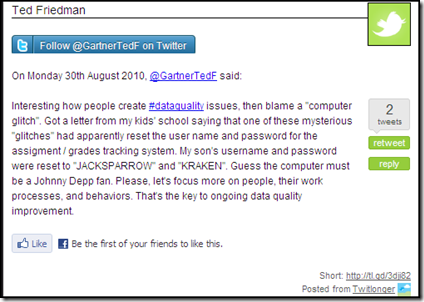
Our data tells us stories about the real world.  Data quality is concerned with how well these stories describe who was involved and what happened.  Master data are the story’s characters and subjects, while transaction data are the events and interactions comprising the narrative of the story.  Let’s use a simple (and fictional) example:

Michelle Davis-Donovan purchases a life insurance policy for her husband Michael Donovan from Vitality Insurance.

The characters are Michelle Davis-Donovan, Michael Donovan, and Vitality Insurance.  The event bringing them together is the purchase of what becomes the subject of the story that connects them, a life insurance policy, around which a narrative forms.

One of the recurring interactions in the narrative are the premium payments that Michelle sends to Vitality.  Another event, occurring later in the story, is Michael’s unexpected death, which triggers both the end of the premium payments and the beginning of the processing of the insurance claim, eventually resulting in a payment made to Michelle by Vitality.

In data management terms, Michelle Davis-Donovan and Michael Donovan (Customers), the life insurance policy (Product), and Vitality Insurance (Vendor) are all master data, and the life insurance premium and claim payments are transaction data.

It may be tempting to think of the similar stories in our databases as non-fiction, as a historical account describing real-world people and events.  After all, it’s probably safe to assume that Vitality Insurance had verified that Michelle had, in fact, paid the premiums on the life insurance policy, as well as verified that Michael was, in fact, dead, before cutting a check for the claim.

But even history is a convenient fiction, which is open to revision based on the presentation of newly discovered “facts.”

Let’s imagine that Michelle starts a new chapter in her life’s story by changing her given name to Clarissa and then marrying Richard Dalloway.  Mrs. Dalloway then purchases a life insurance policy for her husband from Vitality Insurance.

After a few years of bank verified premium payments made by Clarissa to Vitality, Richard unexpectedly dies.

How is this reality described by the data managed by Vitality Insurance?  Is Clarissa Dalloway the same real-world person as Michelle Davis-Donovan?  Is Michelle, if that’s even her real name, killing her husbands to collect on their life insurance policies?

No doubt there are characters, subjects, events, and interactions like these to be found in the stories your data is telling you.

Is your data fact or fiction?  More specifically, is your data a fiction that you feel you have to believe in?


Once Upon a Time in the Data

Stephen Dedalus, the protagonist of A Portrait of the Artist as a Young Man, was James Joyce’s literary alter ego, some aspects of which accurately described him and his actual real-life experiences.  Does this make author and character literally equivalent?

Would data matching routines identify Stephen Dedalus and James Joyce as duplicate customers?

What about your data?  I do not mean the data you work with as a data professional, I mean your personal data.  How many companies view you as a customer?  How many companies have master and transaction data that is telling stories about you?

All of that data is your literary alter ego.  Is that data fact or fiction?  Are all of those stories about you true?

I am pretty sure that the companies believe so, but does every aspect of that data accurately describe you?  Do these stories tell the truth about your current postal addresses, e-mail addresses, and telephone numbers?  Do these stories tell the truth about your age, the number of times you have been married, or how many children you currently have?

I often wonder about my personal data that is roaming countless databases in countless companies, telling stories about how:

“Once upon a time in the data, and a very good time it was, there was some customer data entered, and this customer data that was entered, told the story of a nicens real-world person named Jimmy . . .”

The Future of Our Data’s Story

Data privacy and protection are increasingly prevalent topics of discussion, especially in relation to data moving into the cloud.  Earlier this year, I wrote a blog post that examined some of the impacts of the semantic web on the future of data management.

Lately I’ve been thinking about how these two trends could provide customers with greater control over their literary alter egos, giving them more control over their personal data—and the stories that it could tell.

Perhaps when this finally happens, our data’s story will become more fact than fiction.


Related Posts

DQ-BE: Data Quality Airlines

The Data-Decision Symphony

The Road of Collaboration

The Idea of Order in Data

Hell is other people’s data

To Our Data Perfectionists

Had our organization but money enough, and time,
This demand for Data Perfection would be no crime.

We would sit down and think deep thoughts about all the wonderful ways,
To best model our data and processes, as slowly passes our endless days.
Freed from the Herculean Labors of Data Cleansing, we would sing the rhyme:
“The data will always be entered right, the first time, every time.”

We being exclusively Defect Prevention inclined,
Would only rubies within our perfected data find.
Executive Management would patiently wait for data that’s accurate and complete,
Since with infinite wealth and time, they would never fear the balance sheet.

Our vegetable enterprise data architecture would grow,
Vaster than empires, and more slow.

One hundred years would be spent lavishing deserved praise,
On our brilliant data model, upon which, with wonder, all would gaze.
Two hundred years to adore each and every defect prevention test,
But thirty thousand years to praise Juran, Deming, English, Kaizen, Six Sigma, and all the rest.
An age at least to praise every part of our flawless data quality methodology,
And the last age we would use to write our self-aggrandizing autobiography.

For our Corporate Data Asset deserves this Perfect State,
And we would never dare to love our data at any lower rate.

But at my back I always hear,
Time’s winged chariot hurrying near.

And if we do not address the immediate business needs,
Ignored by us while we were lost down in the data weeds.
Our beautiful enterprise data architecture shall no more be found,
After our Data Perfectionists’ long delay has run our company into the ground.

Because building a better tomorrow at the expense of ignoring today,
Has even with our very best of intentions, caused us to lose our way.
And all our quaint best practices will have turned to dust,
As burnt into ashes will be all of our business users’ trust.

Now, it is true that Zero Defects is a fine and noble goal,
For Manufacturing Quality—YES, but for Data Quality—NO.

We must aspire to a more practical approach, providing a critical business problem solving service,
Improving data quality, not for the sake of our data, but for the fitness of its business purpose.
Instead of focusing on only the bad we have done, forcing us to wear The Scarlet DQ Letter,
Let us focus on the good we are already doing, so from it we can learn how to do even better.

And especially now, while our enterprise-wide collaboration conspires,
To help us grow our Data Governance Maturity beyond just fighting fires.
Therefore, let us implement Defect Prevention wherever and whenever we can,
But also accept that Data Cleansing will always be an essential part of our plan.

Before our organization’s limited money and time are devoured,
Let us make sure that our critical business decisions are empowered.

Let us also realize that since change is the only universal constant,
Real best practices are not cast in stone, but written on parchment.
Because the business uses for our data, as well as our business itself, continues to evolve,
Our data strategy must be adaptation, allowing our dynamic business problems to be solved.

Thus, although it is true that we can never achieve Data Perfection,
We can deliver Business Insight, which always is our true direction.

___________________________________________________________________________________________________________________

This blog post was inspired by the poem To His Coy Mistress by Andrew Marvell.

#FollowFriday and The Three Tweets

Today is Friday, which for Twitter users like me, can mean only one thing . . .

It is FollowFriday—the day when Twitter users recommend other users that you should follow.  In other words, it’s the Twitter version of peer pressure: “I recommended you, why didn't you recommend me?”

So why does anyone follow anyone on Twitter?  There are many theories, mine is called . . .


The Three Tweets

From my perspective, there are only three kinds of tweets:

  1. Informative Tweets — Providing some form of information, or a link to it, these tweets deliver the practical knowledge or thought-provoking theories, allowing you to almost convince your boss that Twitter is a required work activity.
  2. Entertaining Tweets — Providing some form of entertainment, or a link to it, these tweets are often the funny respites thankfully disrupting the otherwise serious (or mind-numbingly boring) routine of your typical business day.
  3. Infotaining Tweets — Providing a combination of information and entertainment, or a link to it, these tweets make you think a little, laugh a little, and go on and sway (just a little) along with the music that often only you can hear.

Let’s take a look at a few examples of each one of The Three Tweets.


Informative Tweets


Entertaining Tweets


Infotaining Tweets


#FollowFriday Recommendations

By no means a comprehensive list, and listed in no particular order whatsoever, here are some great tweeps, and especially for mostly informative tweets about Data Quality, Data Governance, Master Data Management, and Business Intelligence:


PLEASE NOTE: No offense is intended to any of my tweeps not listed above.  However, if you feel that I have made a glaring omission of an obviously Twitterific Tweep, then please feel free to post a comment below and add them to the list.  Thanks!

I hope that everyone has a great FollowFriday and an even greater weekend.  See you all around the Twittersphere.


Related Posts

Dilbert, Data Quality, Rabbits, and #FollowFriday

Twitter, Meaningful Conversations, and #FollowFriday

The Fellowship of #FollowFriday

Video: Twitter #FollowFriday – January 15, 2010

Social Karma (Part 7)

If you tweet away, I will follow

Video: Twitter Search Tutorial

DQ-BE: Data Quality Airlines

Data Quality By Example (DQ-BE) is a new OCDQ segment that will provide examples of data quality key concepts.

“Good morning sir!” said the smiling gentleman behind the counter—and a little too cheerily for 5 o’clock in the morning.  “Welcome to the check-in counter for Data Quality Airlines.  My name is Edward.  How may I help you today?”

“Good morning Edward,” I replied.  “My name is John Smith.  I am traveling to Boston today on flight number 221.”

“Thank you for choosing Data Quality Airlines!” responded Edward.  “May I please see your driver’s license, passport, or other government issued photo identification so that I can verify your data accuracy.”

As I handed Edward my driver’s license, I explained “it’s an old photograph in which I was clean-shaven, wearing contact lenses, and ten pounds lighter” since I now had a full beard, was wearing glasses, and, to be honest, was actually thirty pounds heavier.

“Oh,” said Edward, his plastic smile morphing into a more believable and stern frown.  “I am afraid you are on the No Fly List.”

“Oh, that’s right—because of my name being so common!” I replied while fumbling through my backpack, frantically searching for the piece of paper, which I then handed to Edward.  “I’m supposed to give you my Redress Control Number.”

“Actually, you’re supposed to use your Redress Control Number when making your reservation,” Edward retorted.

“In other words,” I replied, while sporting my best plastic smile, “although you couldn’t verify the accuracy of my customer data when I made my reservation on-line last month, you were able to verify the authorization to immediately charge my credit card for the full price of purchasing a non-refundable plane ticket to fly on Data Quality Airlines.”

“I don’t appreciate your sense of humor,” replied Edward.  “Everyone at Data Quality Airlines takes accuracy very seriously.”

Edward printed my boarding pass, wrote BCS on it in big letters, handed it to me, and with an even more plastic smile cheerily returning to his face, said: “Please proceed to the security checkpoint.  Thank you again for choosing Data Quality Airlines!”

“Boarding pass?” asked the not-at-all smiling woman at the security checkpoint.  After I handed her my boarding pass, she said, “And your driver’s license, passport, or other government issued photo identification so that I can verify your data accuracy.”

“I guess my verified data accuracy at the Data Quality Airlines check-in counter must have already expired,” I joked as I handed her my driver’s license.  “It’s an old photograph in which I was clean-shaven, wearing contact lenses, and ten pounds lighter.”

The woman silently examined my boarding pass and driver’s license, circled BCS with a magic marker, and then shouted over her shoulder to a group of not-at-all smiling security personnel standing behind her: “Randomly selected security screening!”

One of them, a very large man, stepped toward me as the sound from the snap of the fresh latex glove he had just placed on his very large hand echoed down the long hallway that he was now pointing me toward.  “Right this way sir,” he said with a smile.

Ten minutes later, as I slowly walked to the gate for Data Quality Airlines Flight Number 221 to Boston, the thought echoing through my mind was that there is no such thing as data accuracy—there are only verifiable assertions of data accuracy . . .

Related Posts

DQ-Tip: “There is no such thing as data accuracy...”

Why isn’t our data quality worse?

The Real Data Value is Business Insight

Is your data complete and accurate, but useless to your business?

Data Quality and the Cupertino Effect

DQ-Tip: “Data quality is primarily about context not accuracy...”

DQ-Tip: “There is no such thing as data accuracy...”

Data Quality (DQ) Tips is an OCDQ regular segment.  Each DQ-Tip is a clear and concise data quality pearl of wisdom.

“There is no such thing as data accuracy — There are only assertions of data accuracy.”

This DQ-Tip came from the Data Quality Pro webinar ISO 8000 Master Data Quality featuring Peter Benson of ECCMA.

You can download (.pdf file) quotes from this webinar by clicking on this link: Data Quality Pro Webinar Quotes - Peter Benson

ISO 8000 is the international standards for data quality.  You can get more information by clicking on this link: ISO 8000

Data Accuracy

Accuracy, which, thanks to substantial assistance from my readers, was defined in a previous post as both the correctness of a data value within a limited context such as verification by an authoritative reference (i.e., validity) combined with the correctness of a valid data value within an extensive context including other data as well as business processes (i.e., accuracy).

“The definition of data quality,” according to Peter and the ISO 8000 standards, “is the ability of the data to meet requirements.”

Although accuracy is only one of many dimensions of data quality, whenever we refer to data as accurate, we are referring to the ability of the data to meet specific requirements, and quite often it’s the ability to support making a critical business decision.

I agree with Peter and the ISO 8000 standards because we can’t simply take an accuracy metric on a data quality dashboard (or however else the assertion is presented to us) at face value without understanding how the metric is both defined and measured.

However, even when well defined and properly measured, data accuracy is still only an assertion.  Oftentimes, the only way to verify the assertion is by putting the data to its intended use.

If by using it you discover that the data is inaccurate, then by having established what the assertion of accuracy was based on, you have a head start on performing root cause analysis, enabling faster resolution of the issues—not only with the data, but also with the business and technical processes used to define and measure data accuracy.

The Business versus IT—Tear down this wall!

Business Information Technology

This diagram was published in the July 2009 blog post Business Information Technology by Steve Tuck of Datanomic, and was based on a conference conversation with Gwen Thomas of the Data Governance Institute, about the figurative wall, prevalent in most organizations, which literally separates the Business, who usually own its data and understand its use in making critical daily business decisions, from Information Technology (IT), who usually own and maintain the hardware and software infrastructure of its enterprise data architecture.

The success of all enterprise information initiatives requires that this wall be torn down, ending the conflict between the Business and IT, and forging a new collaborative union that Steve and Gwen called Business Information Technology.


Isn’t IT a part of the Business?

In his recent blog post Isn’t IT a Part of “the Business”?, Winston Chen of Kalido examined this common challenge, remarking how “IT is often a cost center playing a supporting role for the frontline functions.  But Finance is a cost center, too.  Is Finance really the Business?  How about Human Resources?  We don’t hear HR people talk about the Business versus HR, do we?”

“Key words are important in setting the tone for communication,” Winston explained.  “When our language suggests IT is not a part of the Business, it cements a damaging us-versus-them mentality.”

“It leads to isolation.  What we need today, more than ever, is close collaboration.”


Purple People

Earlier this year in his blog post “Purple People”: The Key to BI Success, Wayne Eckerson of TDWI used a colorful analogy to discuss this common challenge within the context of business intelligence (BI) programs.

Wayne explained that the color purple is formed by mixing two primary colors: red and blue.  These colors symbolize strong, distinct, and independent perspectives.  Wayne used red to represent IT and blue to represent the Business.

Purple People, according to Wayne, “are key intermediaries who can reconcile the Business and IT and forge a strong and lasting partnership that delivers real value to the organization.”

“Pure technologists or pure business people can’t harness BI successfully.  BI needs Purple People to forge tight partnerships between business people and technologists and harness information for business gain.”

I agree with Wayne, but I believe all enterprise information initiatives, and not just BI, need Purple People for success.


Tearing down the Business-IT Wall

My overly dramatic blog post title is obviously a reference to the famous speech by United States President Ronald Reagan at the Berlin Wall on June 12, 1987.  For more than 25 years, the Berlin Wall had stood as a symbol of not only a divided Germany and divided political ideologies, but more importantly, it was both a figurative and literal symbol of a deeper human divide.

Although Reagan’s speech was merely symbolic of the numerous and complex factors that eventually lead to the dismantling of the Berlin Wall and the end of the Cold War, symbolism is a powerful aspect of human culture—including corporate culture.

The Business-IT Wall is only a figurative wall, but it literally separates the Business and IT in most organizations today.

So much has been written about the need for Business-IT Collaboration on successful enterprise information initiatives that the message is often ignored because people are sick and tired of hearing about it.

However, although there are other barriers to success, and people, process, and technology are all important, by far the most important factor for true and lasting success to be possible is—peoplecollaborating.

Organizations must remove all symbolic obstacles, both figurative and literal, which contribute to the human divide preventing enterprise-wide collaboration within their unique corporate culture.

As for the Business-IT Wall, and all other similar barriers to our collaboration and success, the time is long overdue for us to:

Tear down this wall!

Related Posts

The Road of Collaboration

Finding Data Quality

Data Transcendentalism

Declaration of Data Governance

Podcast: Business Technology and Human-Speak

Not So Strange Case of Dr. Technology and Mr. Business

Data Quality is People!

You're So Vain, You Probably Think Data Quality Is About You

DQ View: Achieving Data Quality Happiness

Data Quality (DQ) View is an OCDQ regular segment.  Each DQ-View is a brief video discussion of a data quality key concept.

Continuing the happiness meme making its way around the data quality blogosphere, which I contributed to with my previous blog posts Delivering Data Happiness and Why isn’t our data quality worse?, in this new DQ-View segment I want to discuss achieving data quality happiness.


DQ View: Achieving Data Quality Happiness


If you are having trouble viewing this video, then you can watch it on Vimeo by clicking on this link: DQ-View on Vimeo


Related Posts

Delivering Data Happiness

Why isn’t our data quality worse?

Video: Oh, the Data You’ll Show!

Data Quality is not a Magic Trick

DQ-View: The Cassandra Effect

DQ-View: Is Data Quality the Sun?

DQ-View: Designated Asker of Stupid Questions

Delivering Data Happiness

Recently, a happiness meme has been making its way around the data quality blogosphere.

Its origins have been traced to a lovely day in Denmark when Henrik Liliendahl Sørensen, with help from The Muppet Show, asked “Why do you watch it?” referring to the typically negative spin in the data quality blogosphere, where it seems we are:

“Always describing how bad data is everywhere.

Bashing executives who don’t get it.

Telling about all the hard obstacles ahead. Explaining you don’t have to boil the ocean but might get success by settling for warming up a nice little drop of water.

Despite really wanting to tell a lot of success stories, being the funny Fozzie Bear on the stage, well, I am afraid I also have been spending most of my time on the balcony with Statler and Waldorf.

So, from this day forward: More success stories.”

In his recent blog posts, The Ugly Duckling and Data Quality Tools: The Cygnets in Information Quality, Henrik has been sharing more success stories, or to phrase it in an even happier way: delivering data happiness.


Delivering Data Happiness

I am reading the great book Delivering Happiness: A Path to Profits, Passion, and Purpose by Tony Hsieh, the CEO of Zappos.

Obviously, the book’s title inspired the title of this blog post. 

One of the Zappos core values is “build a positive team and family spirit,” and I have been thinking about how that applies to data quality improvements, which are often pursued as one of the many aspects of a data governance program.

Most data governance maturity models describe an organization’s evolution through a series of stages intended to measure its capability and maturity, tendency toward being reactive or proactive, and inclination to be project-oriented or program-oriented.

Most data governance programs are started by organizations that are confronted with a painfully obvious need for improvement.

The primary reason that the change management efforts of data governance are resisted is because they rely almost exclusively on negative methods—they emphasize broken business and technical processes, as well as bad data-related employee behaviors.

Although these problems exist and are the root cause of some of the organization’s failures, there are also unheralded processes and employees that prevented other problems from happening, which are the root cause of some of the organization’s successes.

“The best team members,” writes Hsieh while explaining the Zappos core values, “take initiative when they notice issues so that the team and the company can succeed.” 

“The best team members take ownership of issues and collaborate with other team members whenever challenges arise.” 

“The best team members have a positive influence on one another and everyone they encounter.  They strive to eliminate any kind of cynicism and negative interactions.”

The change management efforts of data governance and other enterprise information initiatives often make it sound like no such employees (i.e., “best team members”) currently exist anywhere within an organization. 

The blogosphere, as well as critically acclaimed books and expert presentations at major industry conferences, often seem to be in unanimous and unambiguous agreement in the message that they are broadcasting:

“Everything your organization is currently doing regarding data management is totally wrong!”

Sadly, that isn’t much of an exaggeration.  But I am not trying to accuse anyone of using Machiavellian sales tactics to sell solutions to non-existent problems—poor data quality and data governance maturity are costly realities for many organizations.

Nor am I trying to oversimplify the many real complexities involved when implementing enterprise information initiatives.

However, most of these initiatives focus exclusively on developing new solutions and best practices, failing to even acknowledge the possible presence of existing solutions and best practices.

The success of all enterprise information initiatives requires the kind of enterprise-wide collaboration that is facilitated by the “best team members.”  But where, exactly, do the best team members come from?  Should it really be surprising whenever an enterprise information initiative can’t find any using exclusively negative methods, focusing only on what is currently wrong?

As Gordon Hamilton commented on my previous post, we need to be “helping people rise to the level of the positive expectations, rather than our being codependent in their sinking to the level of the negative expectations.”

We really need to start using more positive methods for fostering change.

Let’s begin by first acknowledging the best team members who are currently delivering data happiness to our organizations.


Related Posts

Why isn’t our data quality worse?

The Road of Collaboration

Common Change

Finding Data Quality

Declaration of Data Governance

The Balancing Act of Awareness

Podcast: Business Technology and Human-Speak

“I can make glass tubes”

Why isn’t our data quality worse?

In psychology, the term negativity bias is used to explain how bad evokes a stronger reaction than good in the human mind.  Don’t believe that theory?  Compare receiving an insult with receiving a compliment—which one do you remember more often?

Now, this doesn’t mean the dark side of the Force is stronger, it simply means that we all have a natural tendency to focus more on the negative aspects, rather than on the positive aspects, of most situations, including data quality.

In the aftermath of poor data quality negatively impacting decision-critical enterprise information, the natural tendency is for a data quality initiative to begin by focusing on the now painfully obvious need for improvement, essentially asking the question:

Why isn’t our data quality better?

Although this type of question is a common reaction to failure, it is also indicative of the problem-seeking mindset caused by our negativity bias.  However, Chip and Dan Heath, authors of the great book Switch, explain that even in failure, there are flashes of success, and following these “bright spots” can illuminate a road map for action, encouraging a solution-seeking mindset.

“To pursue bright spots is to ask the question:

What’s working, and how can we do more of it?

Sounds simple, doesn’t it? 

Yet, in the real-world, this obvious question is almost never asked.

Instead, the question we ask is more problem focused:

What’s broken, and how do we fix it?”


Why isn’t our data quality worse?

For example, let’s pretend that a data quality assessment is performed on a data source used to make critical business decisions.  With the help of business analysts and subject matter experts, it’s verified that this critical source has an 80% data accuracy rate.

The common approach is to ask the following questions (using a problem-seeking mindset):

  • Why isn’t our data quality better?
  • What is the root cause of the 20% inaccurate data?
  • What process (business or technical, or both) is broken, and how do we fix it?
  • What people are responsible, and how do we correct their bad behavior?

But why don’t we ask the following questions (using a solution-seeking mindset):

  • Why isn’t our data quality worse?
  • What is the root cause of the 80% accurate data?
  • What process (business or technical, or both) is working, and how do we re-use it?
  • What people are responsible, and how do we encourage their good behavior?

I am not suggesting that we abandon the first set of questions, especially since there are times when a problem-seeking mindset might be a better approach (after all, it does also incorporate a solution-seeking mindset—albeit after a problem is identified).

I am simply wondering why we often never even consider asking the second set of questions?

Most data quality initiatives focus on developing new solutions—and not re-using existing solutions.

Most data quality initiatives focus on creating new best practices—and not leveraging existing best practices.

Perhaps you can be the chosen one who will bring balance to the data quality initiative by asking both questions:

Why isn’t our data quality better?  Why isn’t our data quality worse?

OCDQ Blog Bicentennial

Welcome to the Obsessive-Compulsive Data Quality (OCDQ) Blog Bicentennial Celebration!

Well, okay, technically a bicentennial is the 200th anniversary of something, and I haven’t been blogging for two hundred years. 

On March 13, 2009, I officially launched this blog.  Earlier this year, I published my 100th blog post.  Thanks to my prolific pace, facilitated by a copious amount of free time due to a rather slow consulting year, this is officially the 200th OCDQ Blog post!

So I decided to rummage through my statistics and archives, and assemble a retrospective of how this all came to pass.  Enjoy!


OCDQ Blog Numerology

The following table breaks down the OCDQ Blog statistics by month (clicking on the month link will take you to its blog archive), with subtotals by year, and overall totals for number of blog posts, unique visitors, and page views.  The most popular blog post for each month was determined using a pseudo-scientific quasi-statistical combination of page views, comments, and re-tweets.

Month

Posts

Unique Visitors

Page Views

Most Popular Blog Post

MAR 2009 5 623 3,347 You're So Vain, You Probably Think Data Quality Is About You
APR 2009 8 2,057 6,846 There are no Magic Beans for Data Quality
MAY 2009 5 2,048 5,084 The Nine Circles of Data Quality Hell
JUN 2009 5 2,105 4,785 Not So Strange Case of Dr. Technology and Mr. Business
JUL 2009 8 2,460 6,083 The Very True Fear of False Positives
AUG 2009 11 2,637 6,146 Hyperactive Data Quality (Second Edition)
SEP 2009 9 2,027 3,778 DQ-Tip: “Data quality is primarily about context not accuracy...”
OCT 2009 11 2,645 5,971 Days Without A Data Quality Issue
NOV 2009 9 2,227 4,177 Beyond a “Single Version of the Truth”
DEC 2009 13 1,698 3,779 Adventures in Data Profiling (Part 8)

2009

84

20,527

49,996


Month

Posts

Unique Visitors

Page Views

Most Popular Blog Post

JAN 2010 14 2,323 4,807 The Dumb and Dumber Guide to Data Quality
FEB 2010 12 2,988 6,296 The Wisdom of the Social Media Crowd
MAR 2010 14 3,548 6,869 The Circle of Quality
APR 2010 15 4,727 8,774 Data, data everywhere, but where is data quality?
MAY 2010 13 2,989 5,418 What going to the dentist taught me about data quality
JUN 2010 15 3,420 6,735 Jack Bauer and Enforcing Data Governance Policies
JUL 2010 13 3,410 8,600 Is your data complete and accurate, but useless to your business?
AUG 2010 17 4,047 8,195 The Real Data Value is Business Insight

2010

113

27,452

55,694


Posts

Unique Visitors

Page Views


Totals

197*

47,979

105,690


* Since this is the third one published in September 2010, it is officially the 200th OCDQ Blog post!


Some of my favorites

In addition to the most popular OCDQ Blog posts listed above by month, the following are some of my personal favorites:

  • The Three Musketeers of Data Quality — Although people, process, and technology are all necessary for data quality success, people are the most important of all.  So, who exactly are some of the most important people on your data quality project?
  • Fantasy League Data Quality — This blog post attempted to explain best practices in action for master data management, data warehousing, business intelligence, and data quality using . . . fantasy league baseball and football.
  • Blog-Bout: “Risk” versus “Monopoly” — A “blog-bout” is a good-natured debate between two bloggers.  Phil Simon and I debated which board game is the better metaphor for an Information Technology (IT) project: “Risk” or “Monopoly.”
  • Collablogaunity — Mashing together the words collaboration, blog, and community, I created the term collablogaunity (which is pronounced “Call a Blog a Unity”) to explain some recommended blogging best practices.
  • Do you enjoy writing? — A literally handwritten blog post about the art of painting with letters and words—aka writing.
  • MacGyver: Data Governance and Duct Tape — This allegedly Emmy Award nominated blog post explains data stewardship, data quality, data cleansing, defect prevention, and data governance—all with help from both MacGyver and Jill Dyché.
  • The Importance of Envelopes — No, this was not a blog post about postal address data quality.  Instead, I used envelopes as a metaphor for effective communication, explaining that the way we deliver our message is as important as our message.
  • Dilbert, Data Quality, Rabbits, and #FollowFriday — This blog post revealed a truth that all data quality experts know well: All data quality issues are caused by rabbits—either a cartoon rabbit named Roger, or an invisible rabbit named Harvey.
  • Finding Data Quality — With lots of help from the movie Finding Nemo, this blog post explains that although it is often discussed only in relation to other enterprise information initiatives, eventually you’ll be finding data quality everywhere.


Find your favorites

Find your favorites by browsing OCDQ Blog content using the following links:

  • Best of OCDQ — Periodically updated listings, organized by topic, of the best OCDQ Blog posts of all time


Thank You

So far, OCDQ Blog has received over 900 comments, which is an average of 50 comments per month, and 5 comments per post. 

Although a fair percentage of the total number of comments are my responses, Commendable Comments is my ongoing series (next entry coming later this month) that celebrates the truly commendable comments that I regularly receive from my readers.

Thank you very much to everyone who reads OCDQ Blog.  Whether you comment or not, your readership is deeply appreciated.

Pirates of the Computer: The Curse of the Poor Data Quality

This recent tweet (expanded using TwitLonger) by Ted Friedman of Gartner Research conspired with the swashbuckling movie Pirates of the Caribbean: The Curse of the Black Pearl, leading, really quite inevitably, to the writing of this Data Quality Tale.


Pirates of the Computer: The Curse of the Poor Data Quality

Jack Sparrow was once the Captain of Information Technology (IT) at the world famous Es el Pueblo Estúpido Corporation. 

However, when Jack revealed his plans for recommending to executive management the production implementation of the new Dystopian Automated Transactional Analysis (DATA) system and its seamlessly integrated Magic Beans software, his First Mate Barbossa mutinied by stealing the plans and successfully pitching the idea to the CIO—thereby getting Captain Sparrow fired.

As the new officially appointed Captain of IT, Barbossa implemented DATA and Magic Beans, which migrated and consolidated all of the organization’s information assets, clairvoyantly detected and corrected existing data quality problems, and once fully implemented into production, was preventing any future data quality problems from happening.

As soon as a source was absorbed into DATA, Magic Beans automatically freed up disk space by deleting all traces of the source, including all backups—somehow even the off-site archives.

DATA was then the only system of record, truly becoming the organization’s Single Version of the Truth.

DATA and Magic Beans seemed almost too good to be true.

And that’s because they were.

A few weeks after the last of the organization’s information assets had been fully integrated into DATA, it was discovered that Magic Beans was apparently infected with a nasty computer virus known as The Curse of the Poor Data Quality.

Mysterious “computer glitches” began causing bizarre data quality issues.  At first, the glitches seemed rather innocuous, such as resetting all user names to “TED FRIEDMAN” and all passwords to “GARTNER RESEARCH.”

But that’s hardly worth mentioning, especially when compared with what happened next.

All of the business-critical information stored in DATA—and all new information added—suddenly became completely inaccurate and totally useless as the basis for making any business decisions.

DATA and Magic Beans were cursed!  It was believed that the only way The Curse of the Poor Data Quality could be lifted was by re-installing the organization’s original systems and software.

William “Backup Bill” Turner, Jack’s only supporter, believing the organization deserved to remain cursed for betraying Jack, sent a USB drive to his young son, Will, which contained the only surviving backup copy of the original systems and software.

Many years later, Will Turner, still wearing his father’s old USB drive around his neck, but not knowing its alleged value, is told by Jack Sparrow that Captain Barbossa killed Will’s father and kidnapped Will’s ex-girlfriend, Elizabeth Swann.

Jack and Will infiltrate the DATA center disguised as PIRATEs (Professional Information Retrieval and Technology Experts). 

Jack tells Will that he needs the USB drive to determine where Elizabeth is being held.  Will gives Jack the USB drive and he uses it to begin restoring the original systems and software.  Moments later, Barbossa and Elizabeth walk into the DATA center.

“Elizabeth!  Don’t worry, I’m here to save you!” Will proudly declares.

“Will?” Elizabeth responds, confused.  “What are you talking about?  You’re here to save me from what?  My new job?”

Embarrassed, and turning toward Jack, Will shouts, “You told me Barbossa killed my father and kidnapped Elizabeth!”

“I’m terribly sorry, but I lied,” replies Jack.  “I’m a PIRATE, that’s what we do.”

“Killed your father?” Barbossa interjects.  “No, not literally.  Years ago, I killed a UNIX process he was running in production, and he threw a temper tantrum then quit.  I just hired Elizabeth last week in order to help us overcome our DATA problems.”

You are Jack Sparrow?” asks Elizabeth.  “You are, without doubt, the worst PIRATE I’ve ever heard of.”

“But you have heard of me,” replies Jack, proudly smiling.

“Security!” yells Barbossa.  “Please escort Mr. Sparrow out of the building—immediately!”

“That’s Captain Sparrow,” Jack retorts.  “And it’s too late, Barbossa!  I just restored the original systems and software.  Ha ha!  DATA and Magic Beans are no more!  Without doubt, this will earn my rightful reinstatement as the Captain of IT!”

“Oh no it won’t,” Barbossa responds slowly, while staring at his monitor in disbelief.  “DATA and Magic Beans are gone alright, but The Curse of the Poor Data Quality remains!”

“The what?” asks Elizabeth.

The Curse of the Poor Data Quality,” Barbossa angrily replies.  “All of our information assets are still completely inaccurate and totally useless as the basis for making any business decisions.  Therefore, we are still cursed with unresolved data quality issues!”

“What did you expect to happen?” remarks Will.  “Technology is never the solution to any problem.  Technology is the problem.  And unabated advancements in technology will eventually lead to computers becoming self-aware and taking over the world.”

Laughing, Barbossa asks, “You do realize that only happens in really bad movies, right?”

“No, curses only happen in really bad movies,” replies Will.  “Sentient computers taking over the world is really going to happen.  After all, it was very clearly explained in that excellent documentary series produced by the governor of California.”

“Oh, shut up Will!” shouts Elizabeth.  “I don’t won’t to hear another one of your anti-technology rants!  That’s why I broke up with you in the first place.  Although technology didn’t cause the data quality problems, Luddite Will is right about one thing, technology is not the solution.”

“What in blazes are you talking about?” Jack and Barbossa retort in unison.

“Seriously, I actually have to explain this?” replies Elizabeth.  “After all, the name of this corporation is Es el Pueblo Estúpido!”

Jack, Barbossa, and Will just stare at Elizabeth with puzzled looks on their faces.

“It’s Spanish for,” explains Elizabeth, “It’s the People, Stupid!

“Well, we don’t speak Spanish,” Barbossa and Jack reply.  “The only languages we speak are Machine Language, FORTRAN, LISP, COBOL, PL/I, BASIC, Pascal, C, C++, C#, Java, JavaScript, Perl, SQL, HTML, XML, PHP, Python, SPARQL . . .”

“Enough!” Elizabeth finally screams. 

“The point that I am trying to make is that although people, business processes, and yes, of course, technology, are all important for successful data quality management, by far the most important of all is . . . Do I really have to say it one more time?”

“It’s the People, Stupid!”

“This corporation should really be renamed to Todos los hombres son idiotas!” Elizabeth concludes, while shaking her head and looking at the clock.  “We can discuss all of this in more detail next week after I return from my Labor Day Weekend vacation.”

“You’re going away for Labor Day Weekend?” asks Will cheerily.  “Perhaps you would be so kind as to invite me to join you?”

“It’s a good thing you’re cute,” replies Elizabeth.  “Yes, you’re invited to join me, but you’ll have to carry my purse—all weekend.”

“Can we pretend,” Will says, grimacing as he reluctantly accepts her purse, “that I am carrying your laptop computer bag?”

“Oh sure, why not?” replies Elizabeth sarcastically with a sly smile.  “And while we’re at it, let’s all just continue pretending that the key to ongoing data quality improvement isn’t focusing more on people, their work processes, and their behaviors . . .”


Related Posts

Data Quality is People!

The Tell-Tale Data

There are no Magic Beans for Data Quality

Do you believe in Magic (Quadrants)?

Data Quality is not a Magic Trick

The Tooth Fairy of Data Quality

Which came first, the Data Quality Tool or the Business Need?

Predictably Poor Data Quality

The Scarlet DQ

The Poor Data Quality Jar

The Data-Decision Symphony

As I have explained in previous blog posts, I am almost as obsessive-compulsive about literature and philosophy as I am about data and data quality, because I believe that there is much that the arts and the sciences can learn from each other.

Therefore, I really enjoyed recently reading the book Proust Was a Neuroscientist by Jonah Lehrer, which shows that science is not the only path to knowledge.  In fact, when it comes to understanding the brain, art got there first.

Without doubt, I will eventually write several blog posts that use references from this book to help me explain some of my perspectives about data quality and its many related disciplines.

In this blog post, with help from Jonah Lehrer and the composer Igor Stravinsky, I will explain The Data-Decision Symphony.


Data, data everywhere

Data is now everywhere.  Data is no longer just in the structured rows of our relational databases and spreadsheets.  Data is also in the unstructured streams of our Facebook and Twitter status updates, as well as our blog posts, our photos, and our videos.

The challenge is can we somehow manage to listen for business insights among the endless cacophony of chaotic data volumes, and use those insights to enable better business decisions and deliver optimal business performance.

Whether you choose to measure it in terabytes, petabytes, or how much reality bites, the data deluge has commenced—and you had better bring your A-Game to D-Town.  In other words, you need to find innovative ways to derive business insight from your constantly increasing data volumes by overcoming the signal-to-noise ratio encountered during your data analysis.


The Music of the Data

This complex challenge of filtering out the noise of the data until you can detect the music of the data, which is just another way of saying the data that you need to make a critical business decision, is very similar to how we actually experience music.

As Jonah Lehrer explains, “music is nothing but a sliver of sound that we have learned how to hear.  Our sense of sound is a work in progress.  Neurons in the auditory cortex are constantly being altered by the songs and symphonies we listen to.”

“Instead of representing the full spectrum of sound waves vibrating inside the ear, the auditory cortex focuses on finding the note amid the noise.  We tune out the cacophony we can’t understand.”

“This is why we can recognize a single musical pitch played by different instruments.  Although a trumpet and violin produce very different sound waves, we are designed to ignore these differences.  All we care about is pitch.”

Instead of attempting to analyze all of the available data before making a business decision, we need to focus on finding the right data signals amid the data noise.  We need to tune out the cacophony of all the data we don’t need.

Of course, this is easier in theory than it is in practice.

But this is why we need to always begin our data analysis with the business decision in mind.  Many organizations begin with only the data in mind, which results in performing analysis that provides little, if any, business insight and decision support.

“But a work of music,” Lehrer continues, “is not simply a set of individual notes arranged in time.”

“Music really begins when the separate pitches are melted into a pattern.  This is a consequence of the brain’s own limitations.  Music is the pleasurable overflow of information.  Whenever a noise exceeds our processing abilities . . . [we stop] . . . trying to understand the individual notes and seek instead to understand the relationship between the notes.”

“It is this psychological instinct—this desperate neuronal search for a pattern, any pattern—that is the source of music.”

Although few would describe analyzing large volumes of data as a “pleasurable overflow of information,” it is our search for a pattern, any pattern in the data relevant to the decision, which allows us to discover a potential source of business insight.


The Data-Decision Symphony

“When we listen to a symphony,” explains Lehrer, “we hear a noise in motion, each note blurring into the next.”

“The sound seems continuous.  Of course, the physical reality is that each sound wave is really a separate thing, as discrete as the notes written in the score.  But this isn’t the way we experience the music.”

“We continually abstract on our own inputs, inventing patterns in order to keep pace with the onrush of noise.  And once the brain finds a pattern, it immediately starts to make predictions, imagining what notes will come next.  It projects imaginary order into the future, transposing the melody we have just heard into the melody we expect.  By listening for patterns, by interpreting every note in terms of expectations, we turn the scraps of sound into the ebb and flow of a symphony.”

This is also how we arrive at making a critical business decision based on data analysis. 

We discover a pattern of business context, relevant to the decision, and start making predictions, imagining what will come next, projecting imaginary order into the data stream, turning bits and bytes into the ebb and flow of The Data-Decision Symphony.

However, our search for the consonance of business context among the dissonance of data, could cause us to draw comforting, but false, conclusions—especially if unaware of any confirmation bias—resulting in bad, albeit data-driven, business decisions.

The musicologist Leonard Meyer, in his 1956 book Emotion and Meaning in Music, explained how “music is defined by its flirtation with—but not submission to—expectations of order.  Although music begins with our predilection for patterns, the feeling of music begins when the pattern we imagine starts to break down.”

Lehrer explains how Igor Stravinsky, in The Rite of Spring, “forces us to generate patterns from the music itself, and not from our preconceived notions of what the music should be like.”

Therefore, we must be vigilant when we perform data analysis, making sure to generate patterns from the data itself, and not from our preconceived notions of what the data should be like—especially when we encounter less than perfect data quality.

As Jonah Lehrer explains, “the brain is designed to learn by association: if this, then that.  Music works by subtly toying with our expected associations, enticing us to make predictions and then confronting us with our prediction errors.”

“Music is the sound of art changing the brain.”

The Data-Decision Symphony is the sound of the art and science of data analysis enabling better business decisions.


Related Posts

Data, data everywhere, but where is data quality?

The Real Data Value is Business Insight

The Road of Collaboration

The Idea of Order in Data

Hell is other people’s data

The Circle of Quality


Data Quality Music (DQ-Songs)

A Record Named Duplicate

New Time Human Business

People

You Can’t Always Get the Data You Want

A spoonful of sugar helps the number of data defects go down

Data Quality is such a Rush

I’m Bringing DQ Sexy Back

Imagining the Future of Data Quality

The Very Model of a Modern DQ General

Video: Oh, the Data You’ll Show!

In May, I wrote a Dr. Seuss style blog post called Oh, the Data You’ll Show! inspired by the great book Oh, the Places You'll Go!

In the following video, I have recorded my narration of the presentation format of my original blog post.  Enjoy!


Oh, the Data You’ll Show!


If you are having trouble viewing this video, then you can watch it on Vimeo by clicking on this link: Oh, the Data You’ll Show!

And you can download the presentation (PDF file) used in the video by clicking on this link: Oh, the Data You’ll Show! (Slides)

And you can listen to and/or download the podcast (MP3 file) by clicking on this link: Oh, the Data You’ll Show! (Podcast)

“Some is not a number and soon is not a time”

In a true story that I recently read in the book Switch: How to Change Things When Change Is Hard by Chip and Dan Heath, back in 2004, Donald Berwick, a doctor and the CEO of the Institute for Healthcare Improvement, had some ideas about how to reduce the defect rate in healthcare, which, unlike the vast majority of data defects, was resulting in unnecessary patient deaths.

One common defect was deaths caused by medication mistakes, such as post-surgical patients failing to receive their antibiotics in the specified time, and another common defect was mismanaging patients on ventilators, resulting in death from pneumonia.

Although Berwick initially laid out a great plan for taking action, which proposed very specific process improvements, and was supported by essentially indisputable research, few changes were actually being implemented.  After all, his small, not-for-profit organization had only 75 employees, and had no ability whatsoever to force any changes on the healthcare industry.

So, what did Berwick do?  On December 14, 2004, in a speech that he delivered to a room full of hospital administrators at a major healthcare industry conference, he declared:

“Here is what I think we should do.  I think we should save 100,000 lives.

And I think we should do that by June 14, 2006—18 months from today.

Some is not a number and soon is not a time.

Here’s the number: 100,000.

Here’s the time: June 14, 2006—9 a.m.”

The crowd was astonished.  The goal was daunting.  Of course, all the hospital administrators agreed with the goal to save lives, but for a hospital to reduce its defect rate, it has to first acknowledge having a defect rate.  In other words, it has to admit that some patients are dying needless deaths.  And, of course, the hospital lawyers are not keen to put this admission on the record.


Data Denial

Whenever an organization’s data quality problems are discussed, it is very common to encounter data denial.  Most often, this is a natural self-defense mechanism for the people responsible for business processes, technology, and data—and understandable because of the simple fact that nobody likes to be blamed (or feel blamed) for causing or failing to fix the data quality problems.

But data denial can also doom a data quality improvement initiative from the very beginning.  Of course, everyone will agree that ensuring high quality data is being used to make critical daily business decisions is vitally important to corporate success, but for an organization to reduce its data defects, it has to first acknowledge having data defects.

In other words, the organization has to admit that some business decisions are mistakes being made based on poor quality data.


Half Measures

In his excellent recent blog post Half Measures, Phil Simon discussed the compromises often made during data quality initiatives, half measures such as “cleaning up some of the data, postponing parts of the data cleanup efforts, and taking a wait and see approach as more issues are unearthed.”

Although, as Phil explained, it is understandable that different individuals and factions within large organizations will have vested interests in taking action, just as others are biased towards maintaining the status quo, “don’t wait for the perfect time to cleanse your data—there isn’t any.  Find a good time and do what you can.”


Remarkable Data Quality

As Seth Godin explained in his remarkable book Purple Cow: Transform Your Business by Being Remarkable, the opposite of remarkable is not bad or mediocre or poorly done.  The opposite of remarkable is very good.

In other words, you must first accept that your organization has data defects, but most important, since some is not a number and soon is not a time, you must set specific data quality goals and specific times when you will meet (or exceed) your goals.

So, what happened with Berwick’s goal?  Eighteen months later, at the exact moment he’d promised to return—June 14, 2006, at 9 a.m.—Berwick took the stage again at the same major healthcare industry conference, and announced the results:

“Hospitals enrolled in the 100,000 Lives Campaign have collectively prevented an estimated 122,300 avoidable deaths and, as importantly, have begun to institutionalize new standards of care that will continue to save lives and improve health outcomes into the future.”

Although improving your organization’s data quality—unlike reducing defect rates in healthcare—isn’t a matter of life and death, remarkable data quality is becoming a matter of corporate survival in today’s highly competitive and rapidly evolving world.

Perfect data quality is impossible—but remarkable data quality is not.  Be remarkable.